• CASE STUDY
04/04
ZWC & SIC
Project information
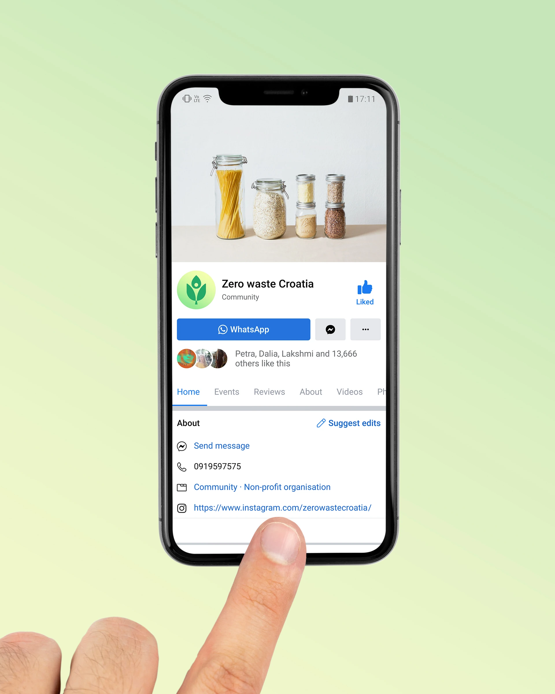
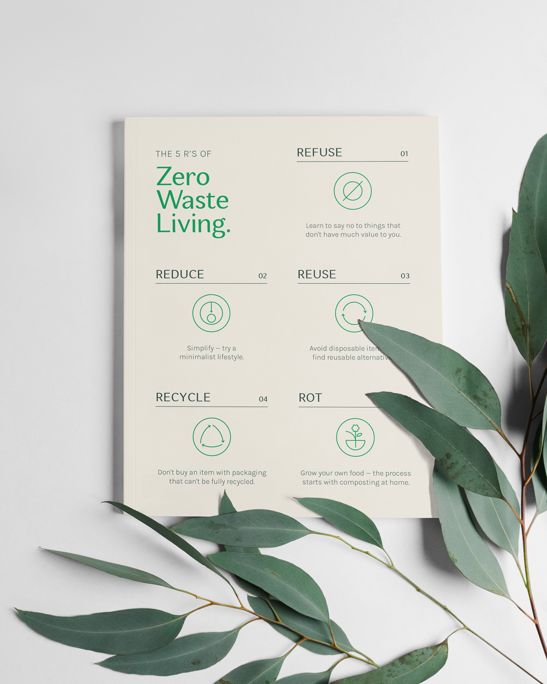
The organization Zero Waste Croatia (ZWC) is a platform that advocates for environmental sustainability, circular economy and, of course, a zero-waste lifestyle. The organization currently has 20K+ followers throughout its social media channels.
Sharing is Caring (SIC) is a community that is currently represented through Facebook groups that have over 100K members across Croatia. The goal of these groups is to donate items, which ultimately reduces waste and the need for consumerism.
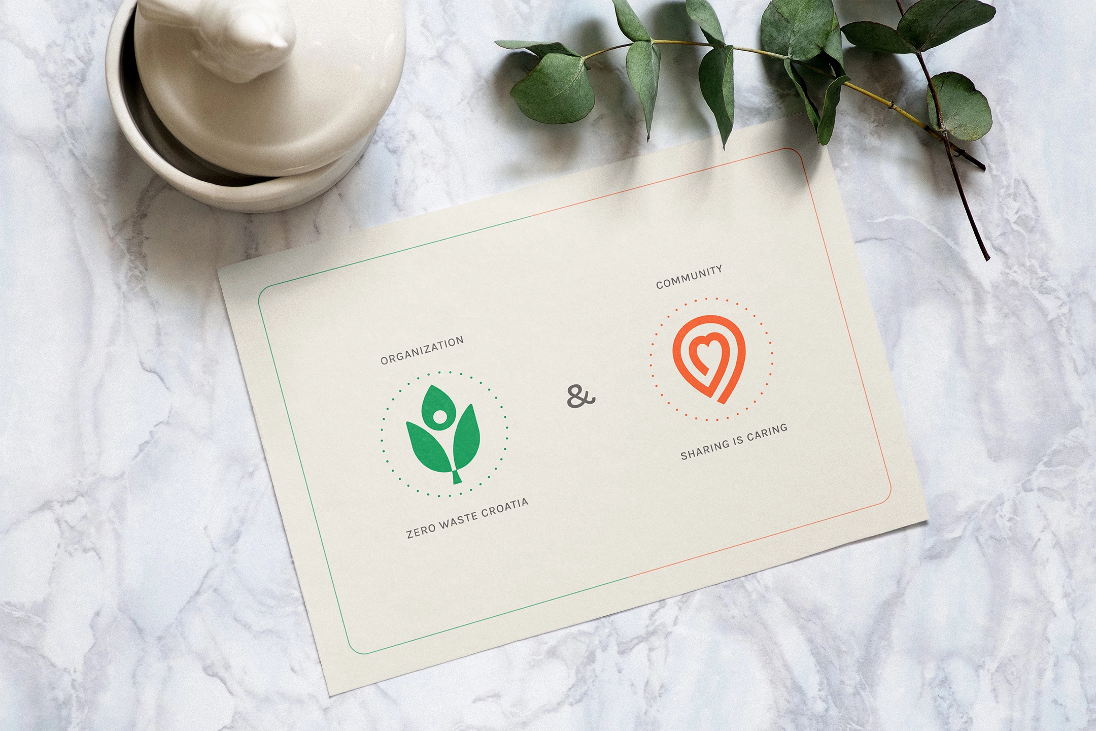
As can be seen, both organizations / communities have a lot in common. The problem is that, although there are many who support their venture, a large number of people don’t know that the mentioned organizations are connected—they are under the leadership of the same small circle of people.
The main reason is the lack of a defined identity & visual communication. That’s where Joe stepped in—by creating a visual identity system that connects and presents them as members of the same family.
Logo
Design
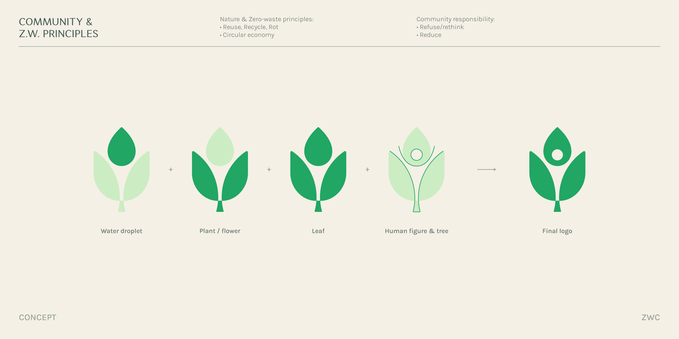
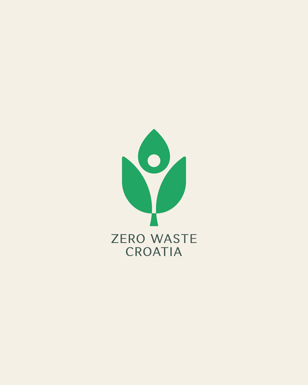
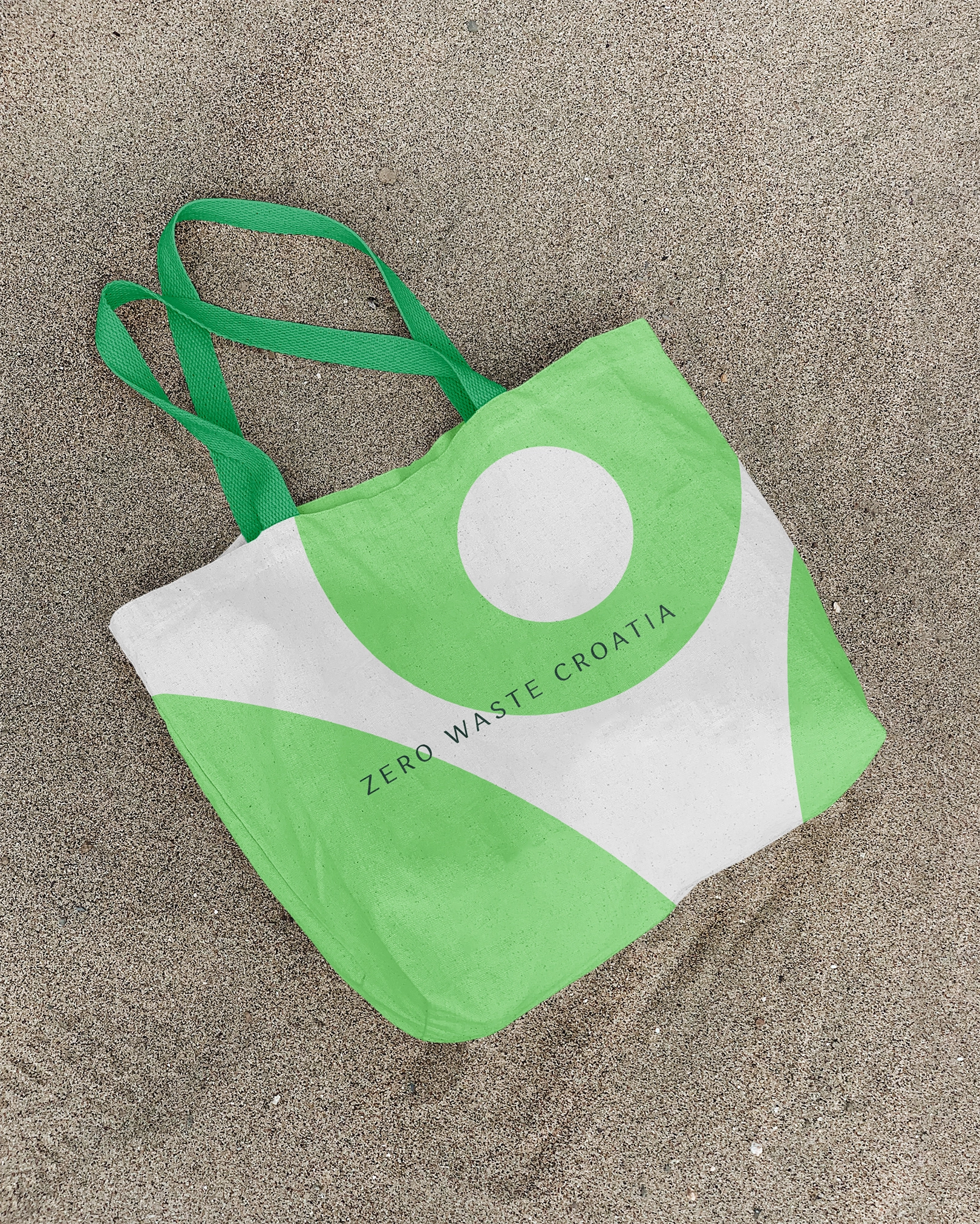
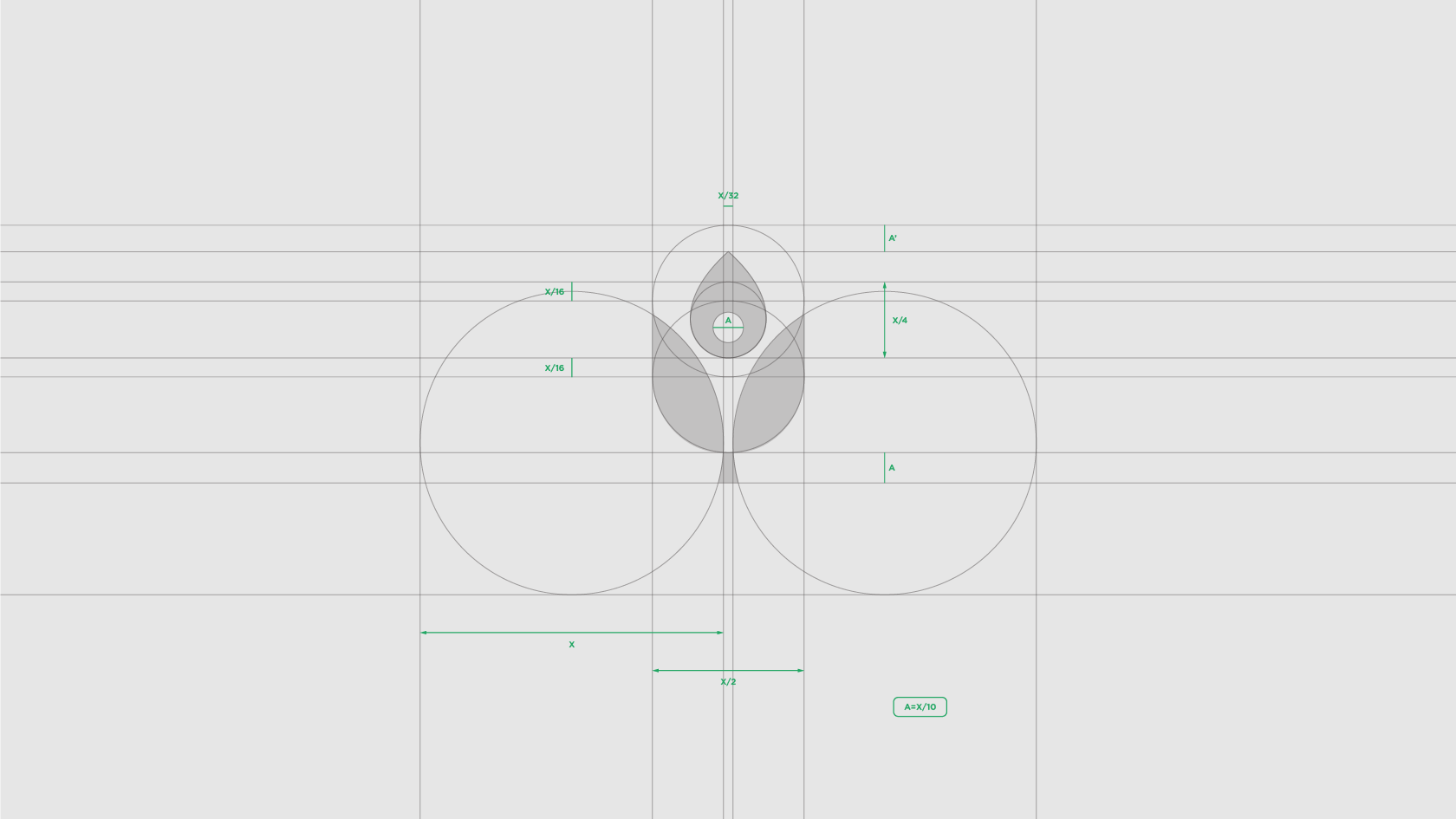
The logo of the ZWC organization symbolizes the importance of each member within the community. The environmental elements—water droplet, leaf, plant, and a flower, shape the motif of the human figure in the negative space. The motif represents a community that strives to preserve the environment through a zero-waste lifestyle.
The symmetry of the symbol is associated with solidarity and equality within the organization. The inspiration for symmetry comes from the perfection of nature—because nature is the only true example of the Zero Waste concept that the community is constantly striving for.


App Icon
Design
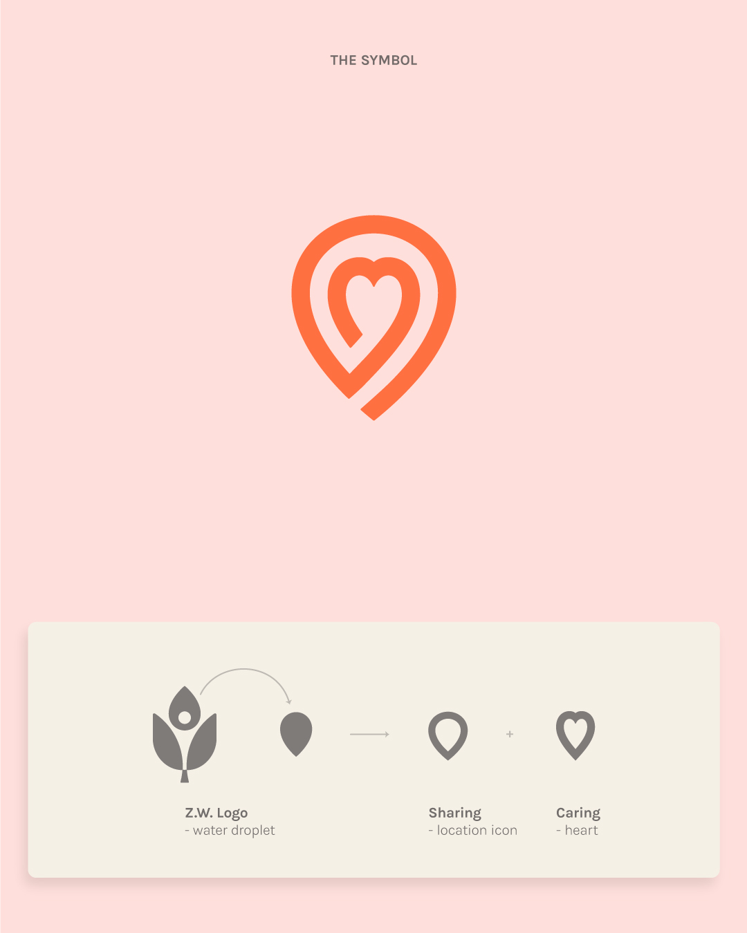
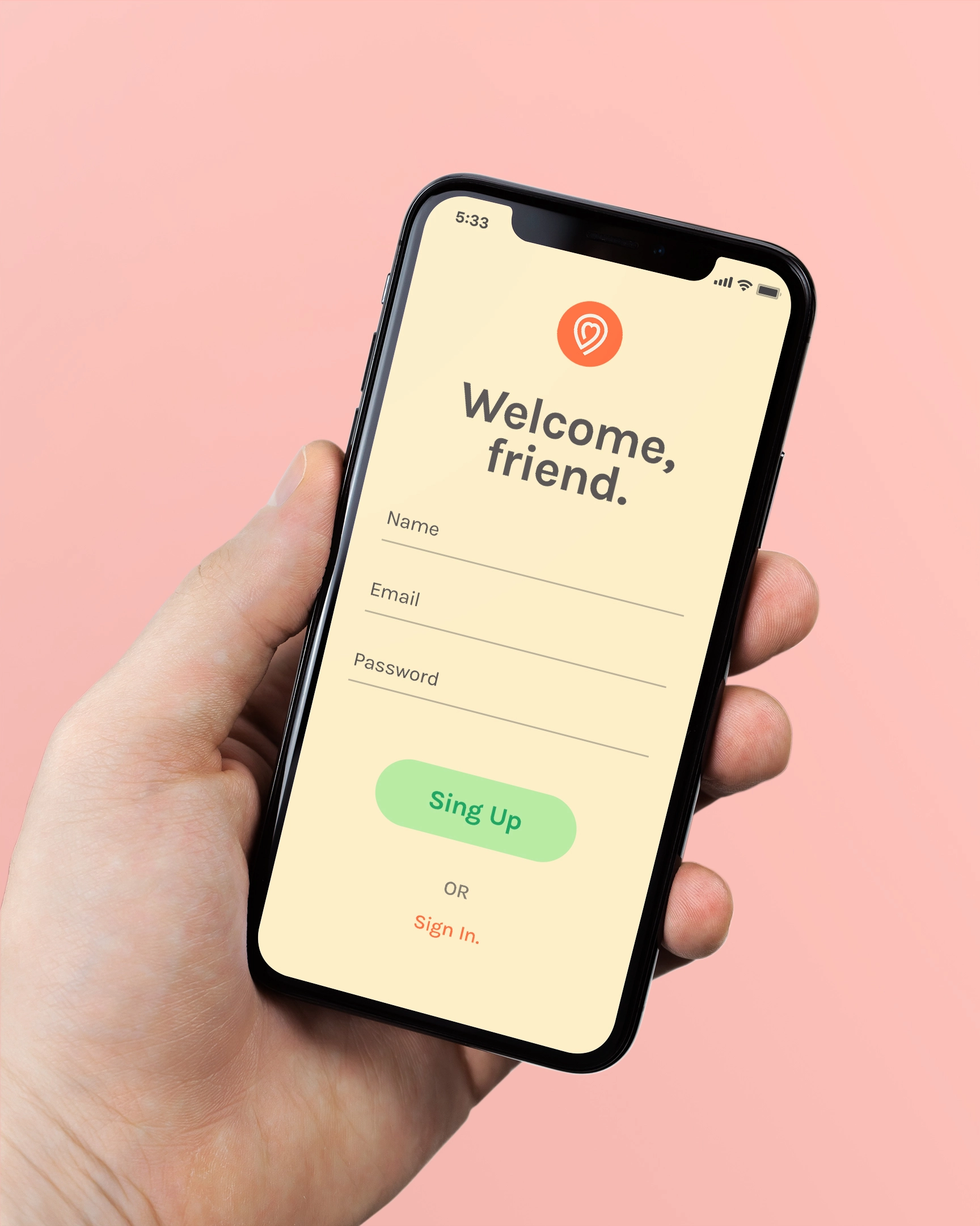
The SIC logo connects two essential elements: location icon and a symbol of heart. Location icon represents the time and place the item was shared. This is the main purpose of the app—to enable the exchange as easily as possible.
The heart represents the human aspect. After giving or receiving an item, both persons are left with a heartwarming feel—which is reflected in the use of warm colors.
The entire icon is one thick line that moves from the outside to the inside of the logo, and back. This symbolizes the idea of a circular economy—an almost closed loop.

Visual
Harmony
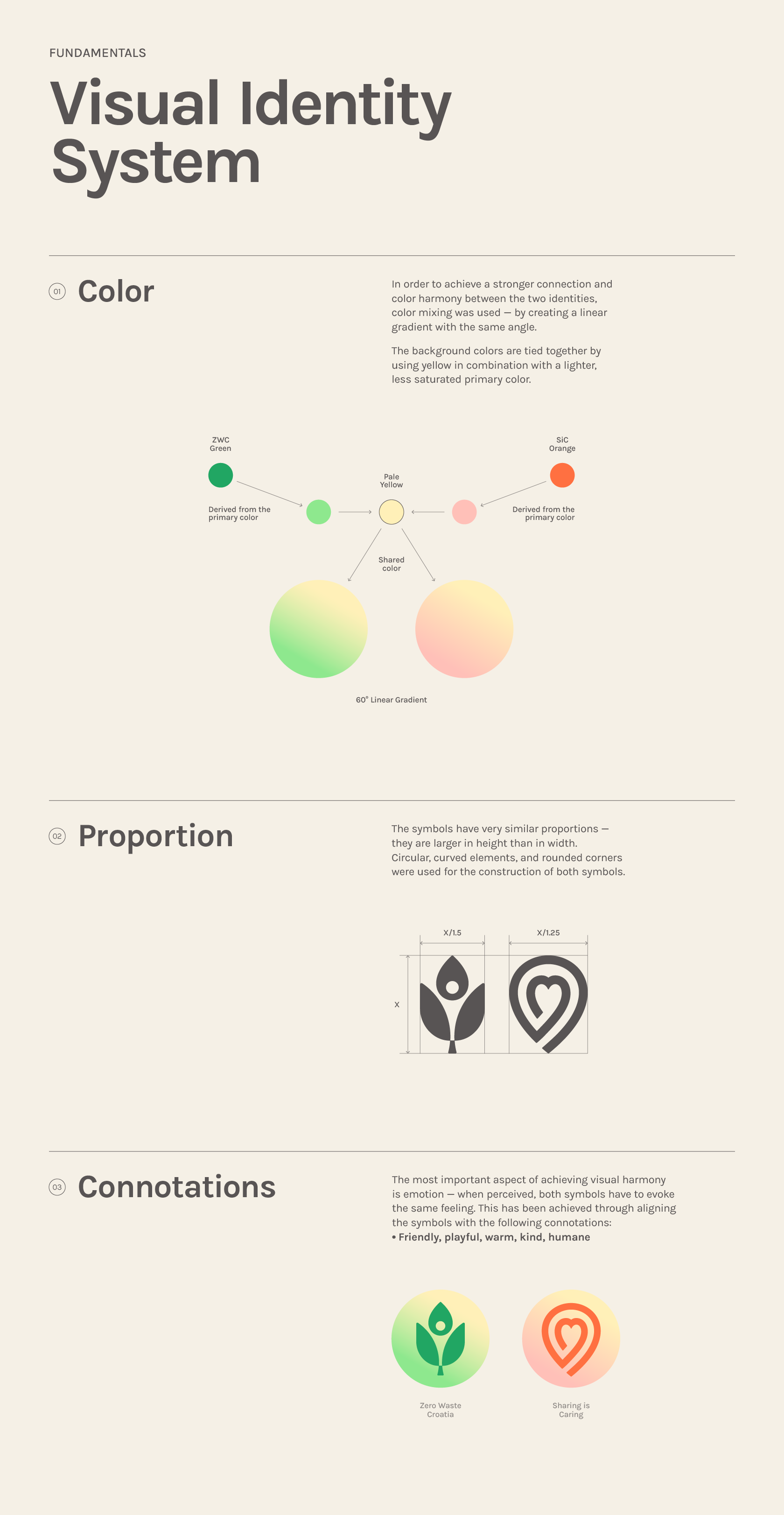
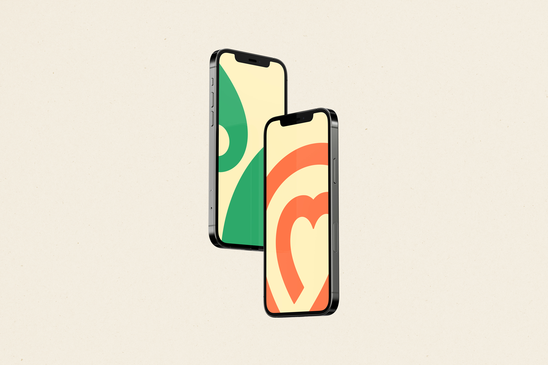
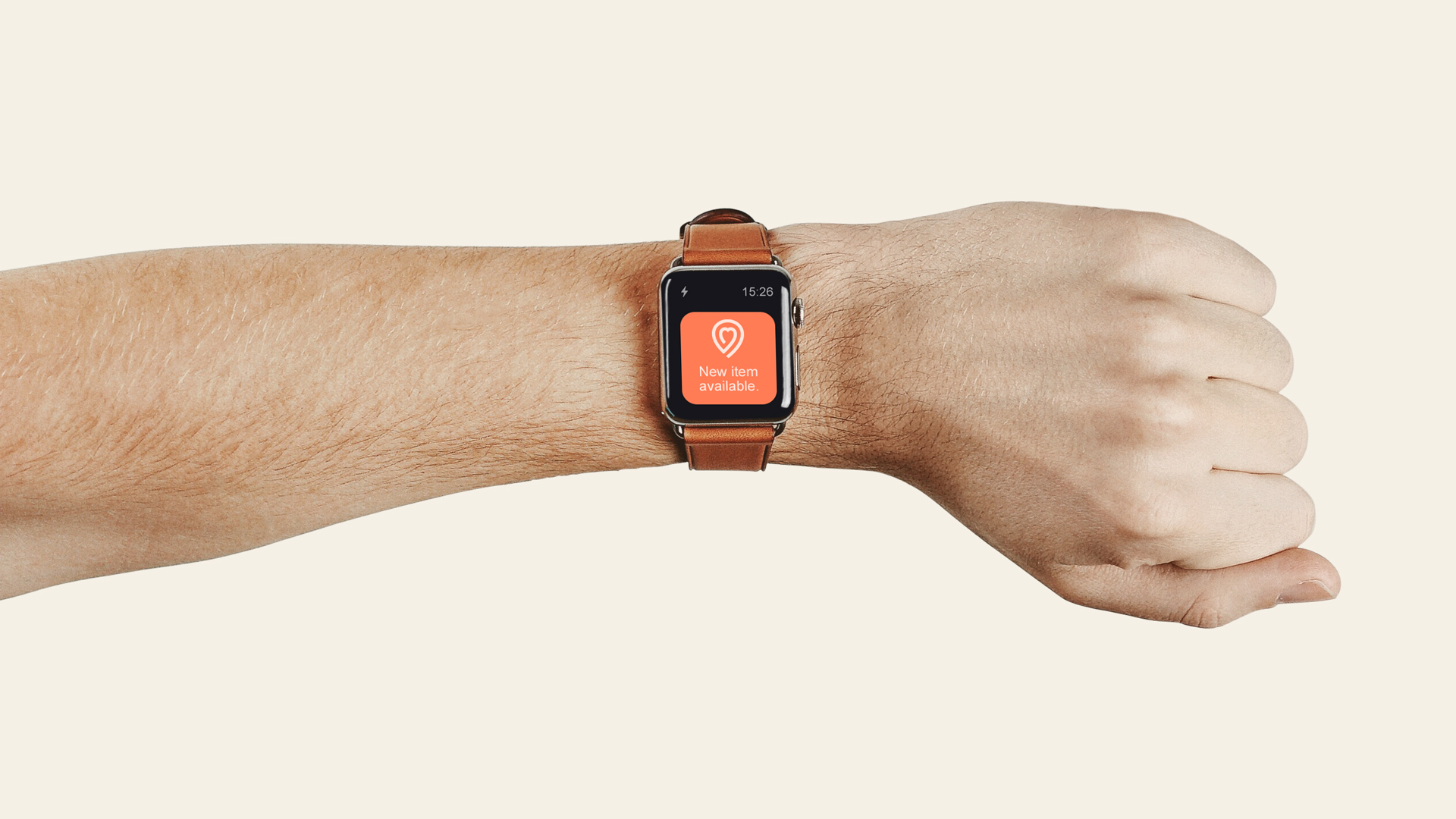
The initiative to create a SIC mobile app (currently under development) further strengthened the idea of creating a visual identity system between organizations. Given that the visual identity for SIC had to be created, which will primarily serve the application, but also for other community channels—it was a good moment to also create a new visual identity for the ZWC organization.
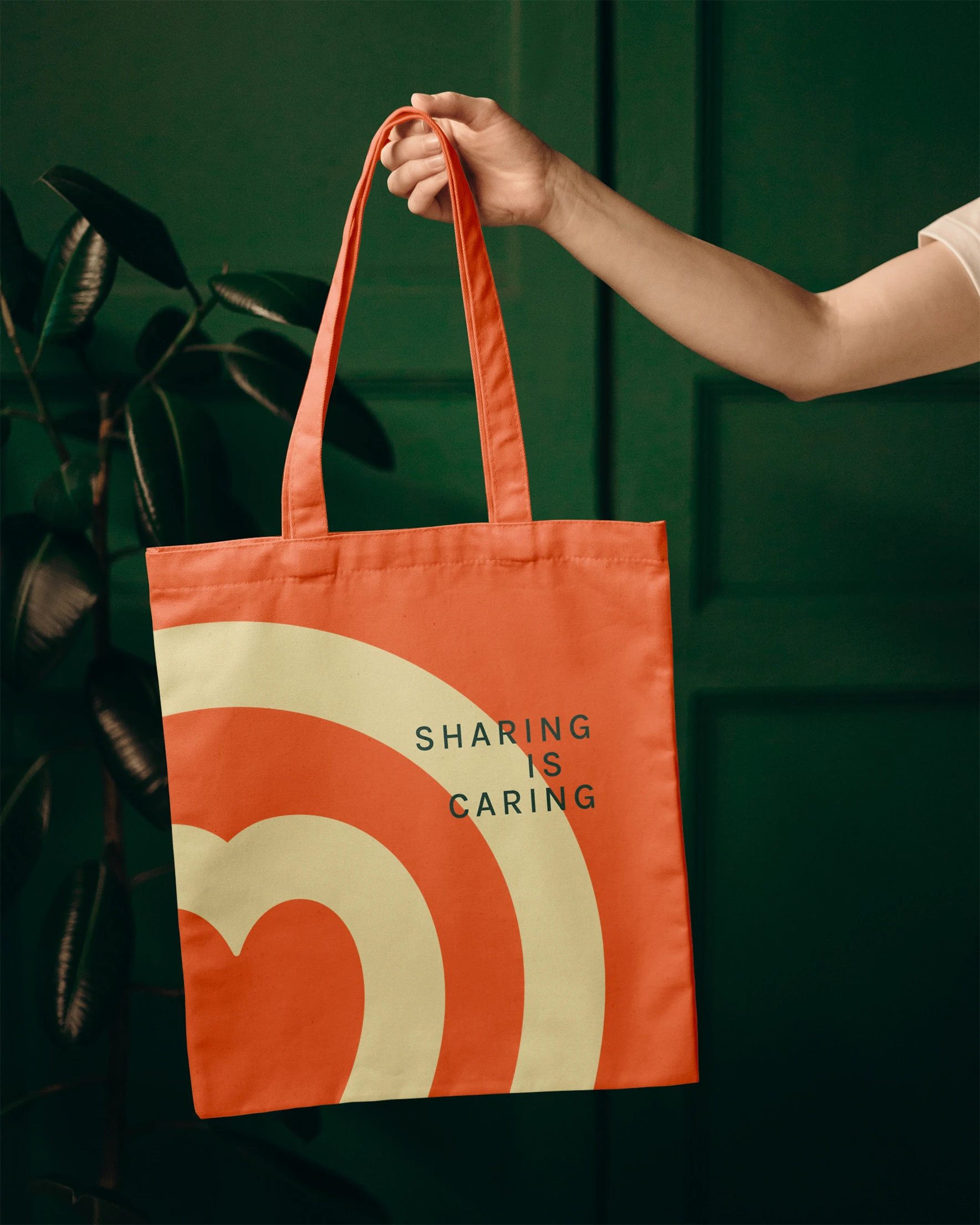
Instead of acting as separate entities, a system was created that unites them, thus achieving visual harmony between the organizations.
Since the use of both logos will mostly be digital—applied in smaller sizes (app icon, profile picture, social media posts etc.). For this reason, it was important to design symbols that are simple, contemporary, recognizable and memorable —so they can stand out in the digital world.
