• CASE STUDY
02/04
Osvani
Concept
Project information
Motion Design, Photography, Ad Concepts
There are many competitors on the market in the category of healthy snacks (nuts & dried fruits) that offer an eco-friendly option for their products. However, most of them hide behind the “Greenwashing” terminology that misleads the customer and gives them false information about how environmentally conscious their brand really is.
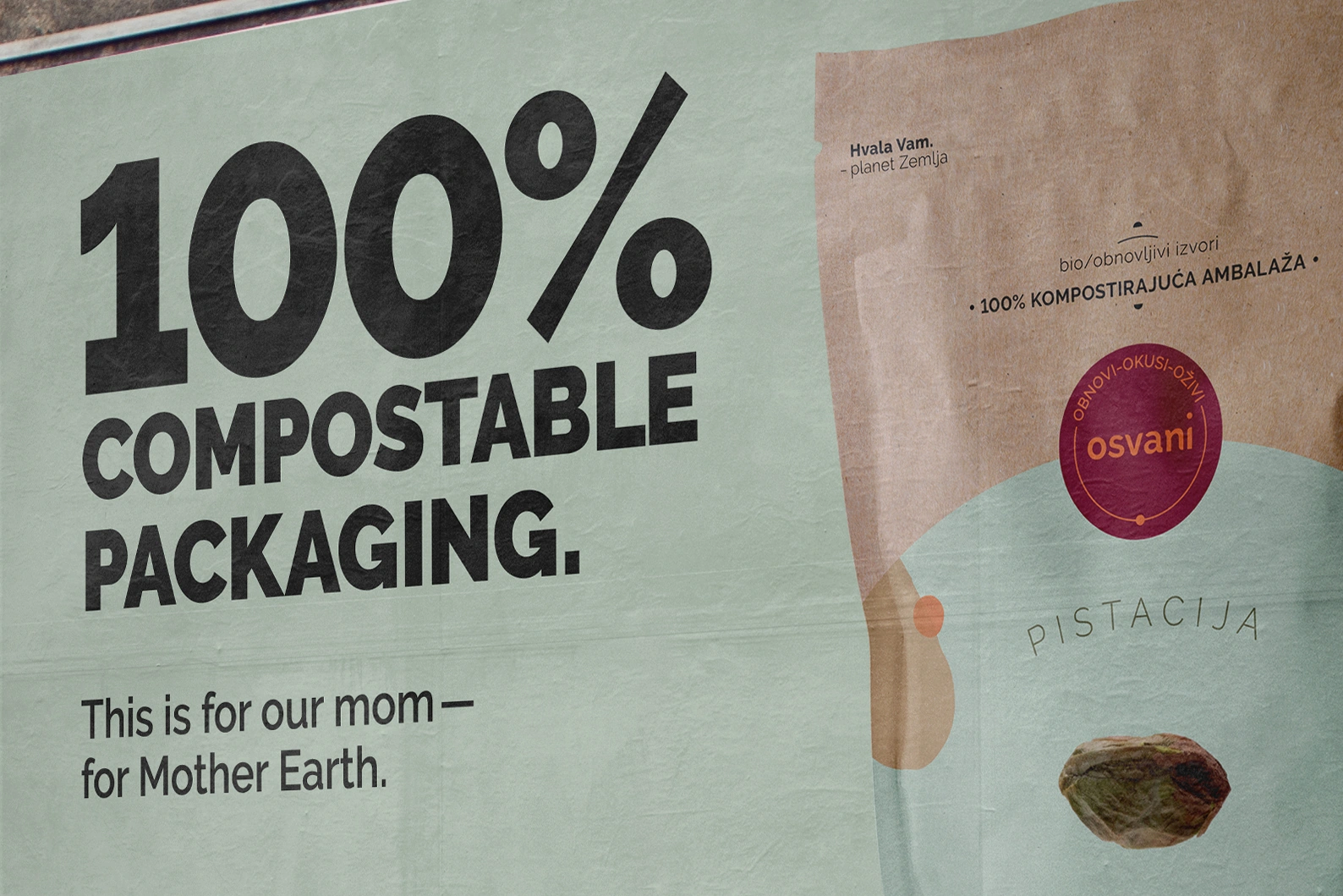
The complete opposite of this is the Osvani brand, which uses one of the most sustainable solutions—100% compostable packaging. The packaging is made from bio/
renewable resources that enable complete decomposition of the packaging (under certain conditions) within 180 days.
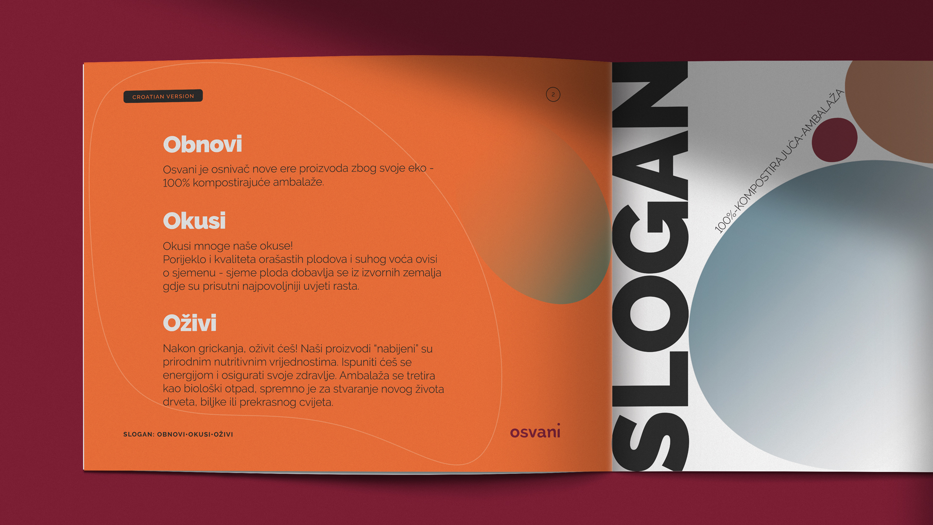
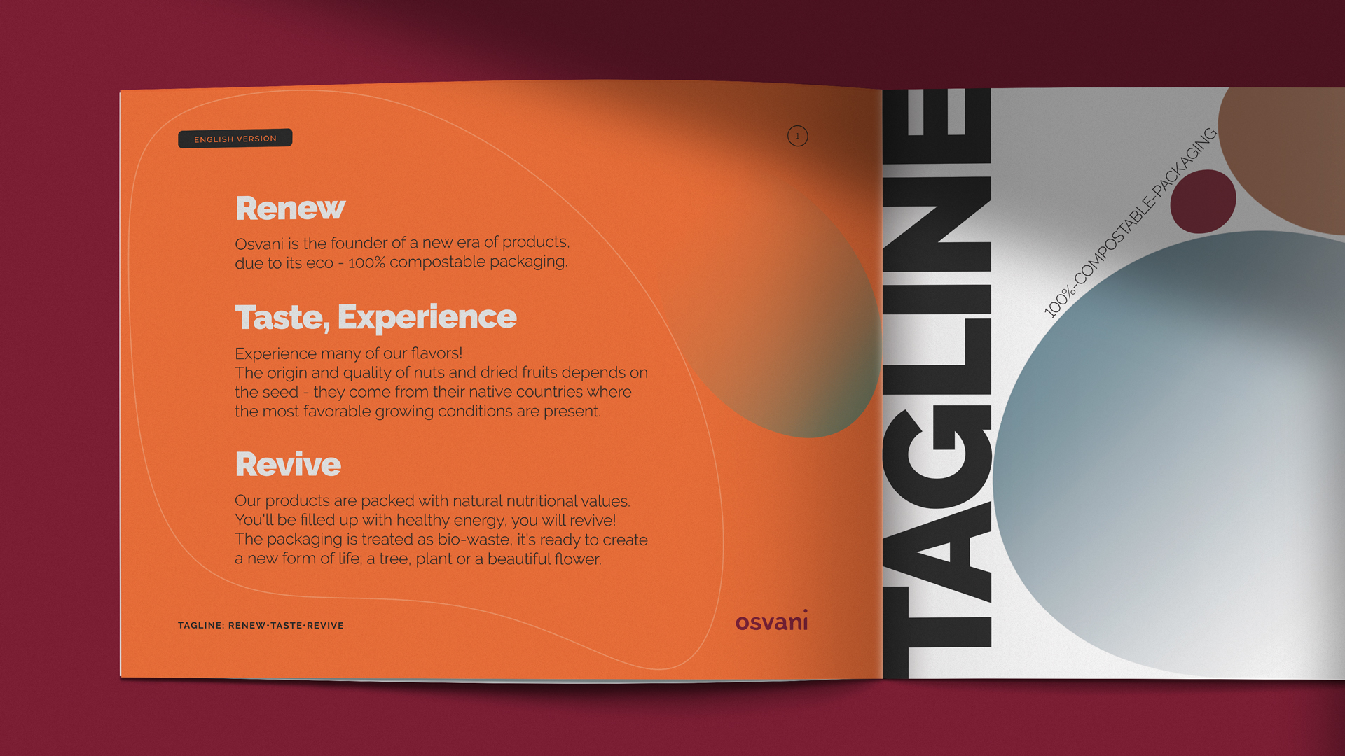
What sets Osvani apart is precisely their purpose as a brand that directly and positively impacts planet Earth. Joe’s role was to emphasize their purpose by creating a new name & tagline, designing a visual identity, and defining their tone of voice—ultimately, positioning the Osvani brand as a pioneer of a new era of products.
• promo video
Brand
Strategy
This product is for the mindful people who want to reduce their level of ecological footprint. The target audience also includes environmentally conscious vegans and vegetarians who often consume nuts & dried fruits.
Osvani is a purpose-driven brand. Their vision—to be part of the change for the benefit of our planet, is in line with their mission—use innovative, sustainable packaging for their current and future products, leaving no waste behind.
Their strategy & design differentiates them from the trendy “eco-friendly” competitors who in realty, don’t offer a truly sustainable option.
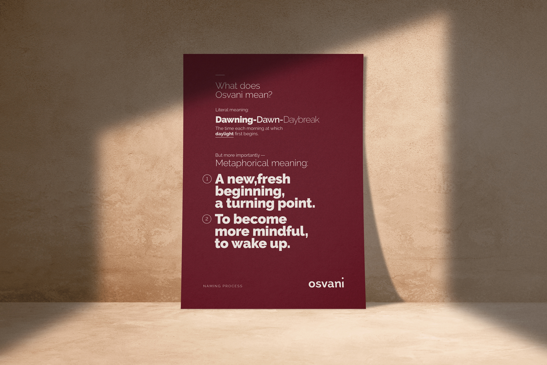
• NAME EXPLANATION
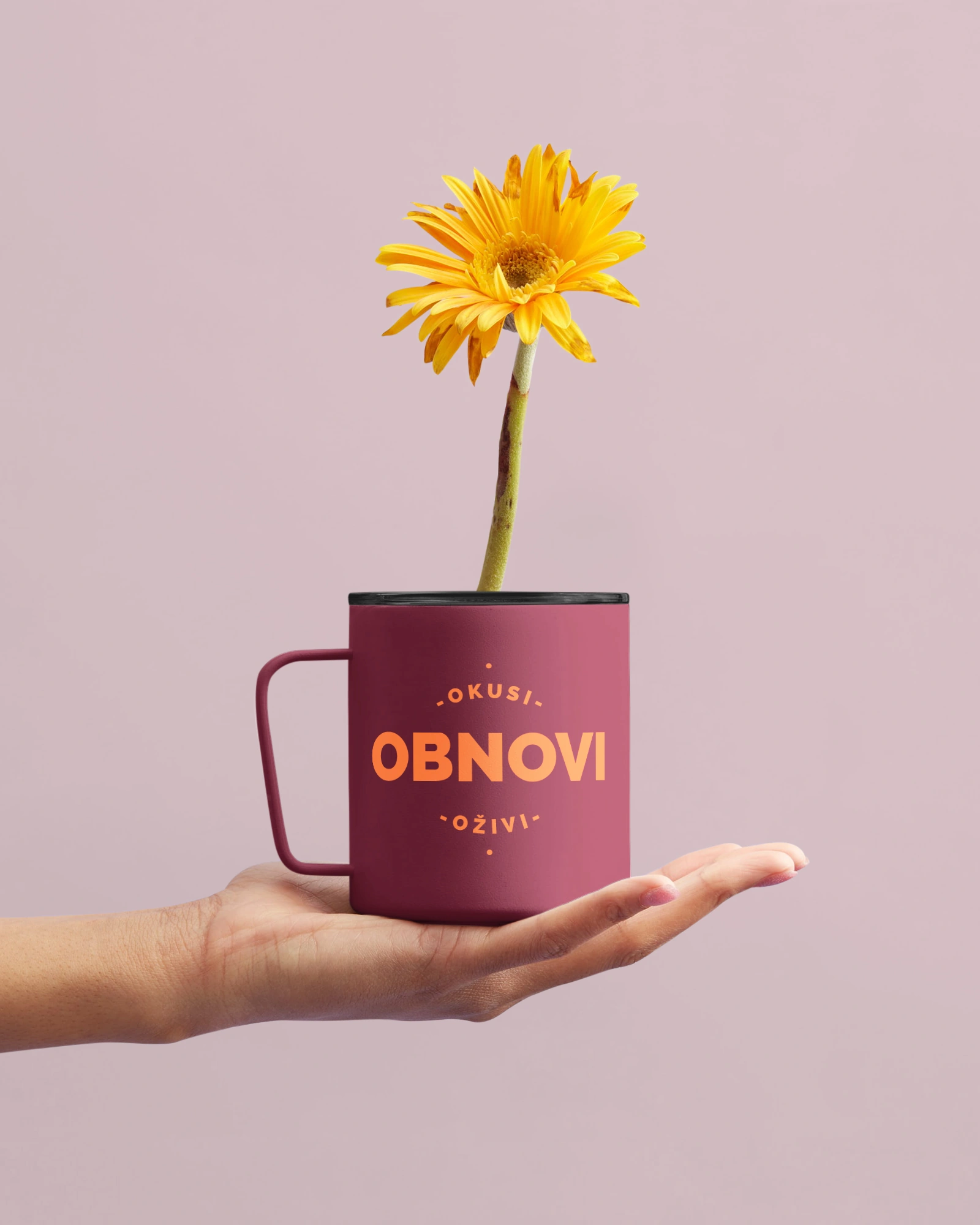
• TAGLINE - CROATIAN
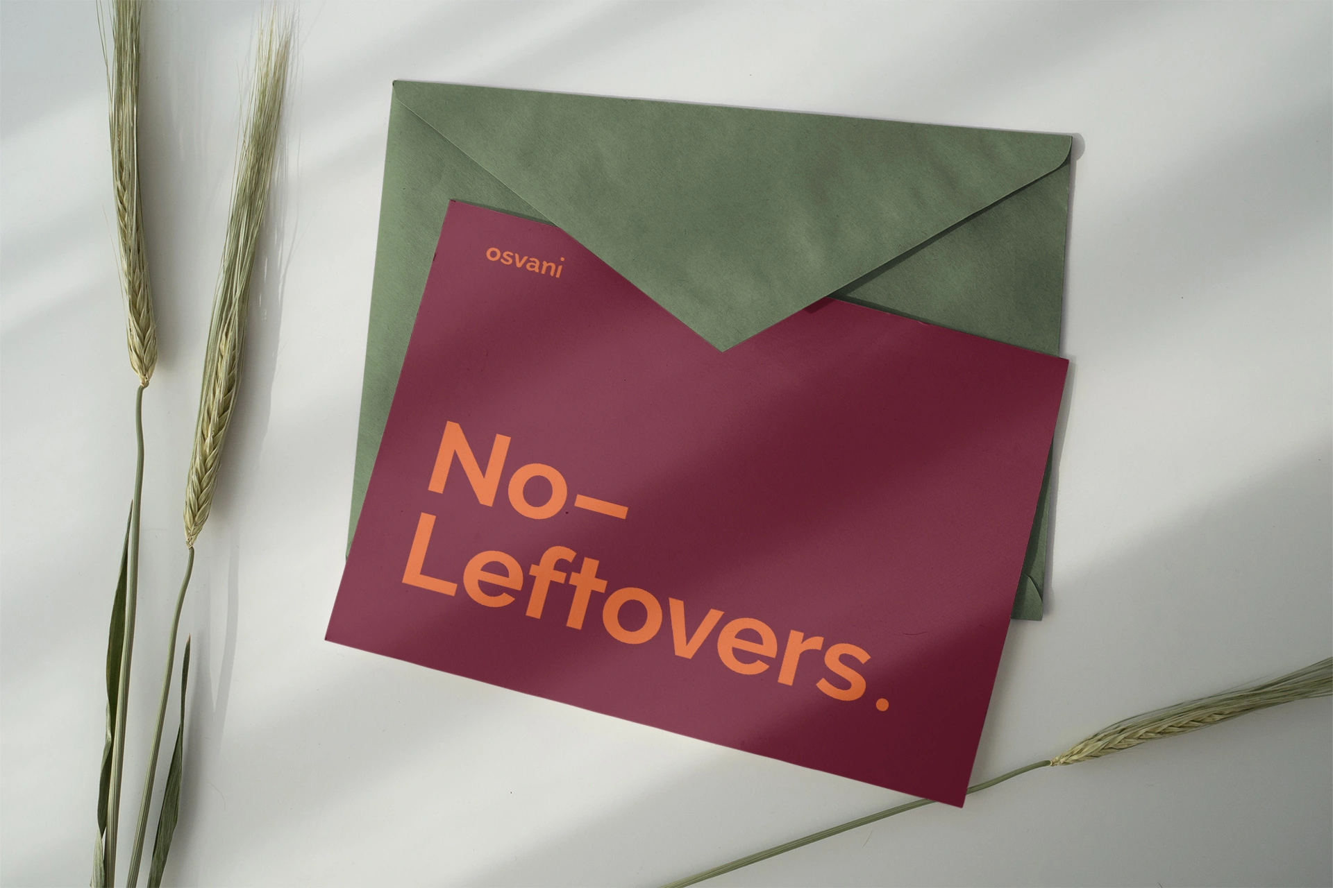
• TAGLINE - ENGLISH
Brand
Identity
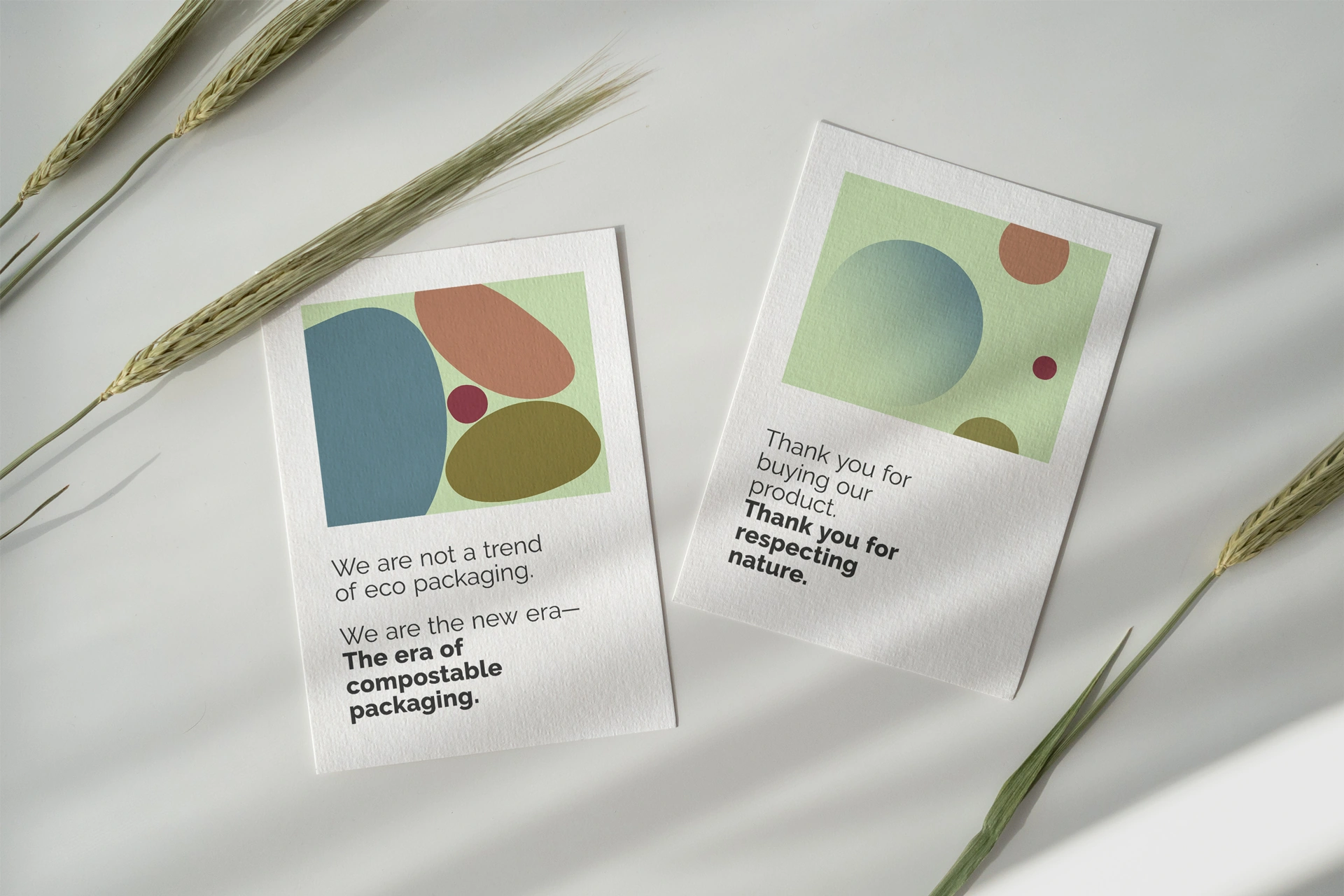
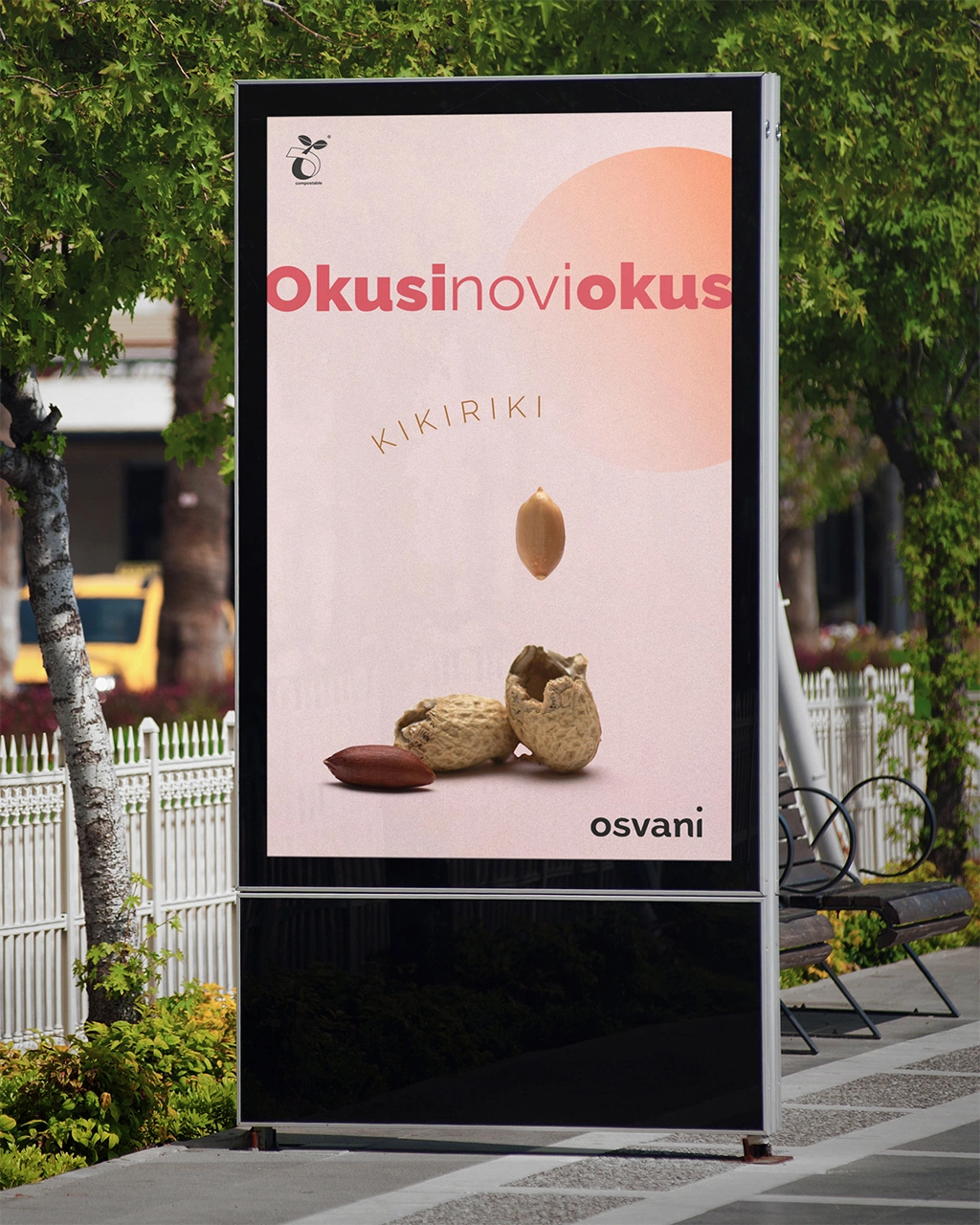
In a nutshell (pun intended), Joe has created a visual systemthat tells / shows the brand’s story. The use of endless loops in animation and video elements is associated with the value of sustainable packaging. The composting process is a loop, it creates circular economy, which also explains why there is a lot of circular graphic elements in the visual system.
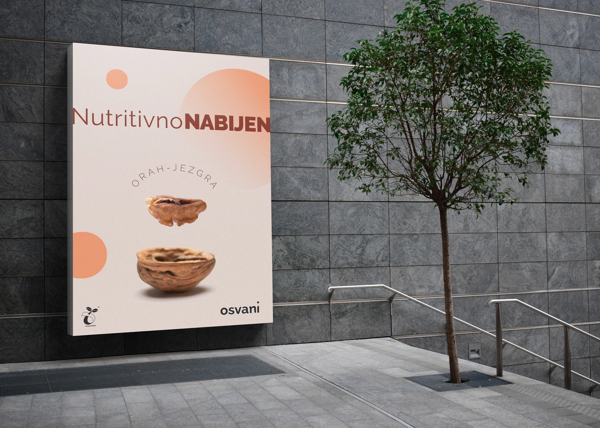
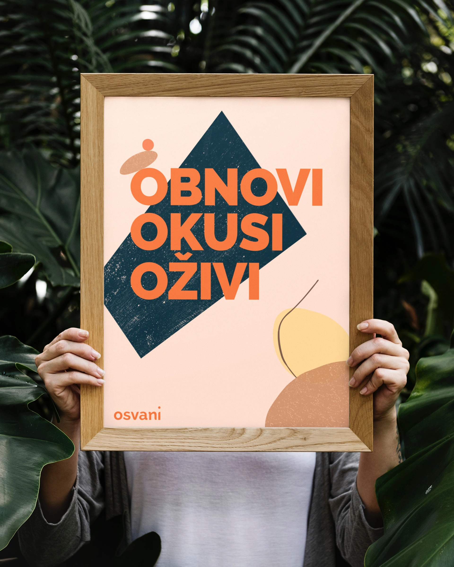
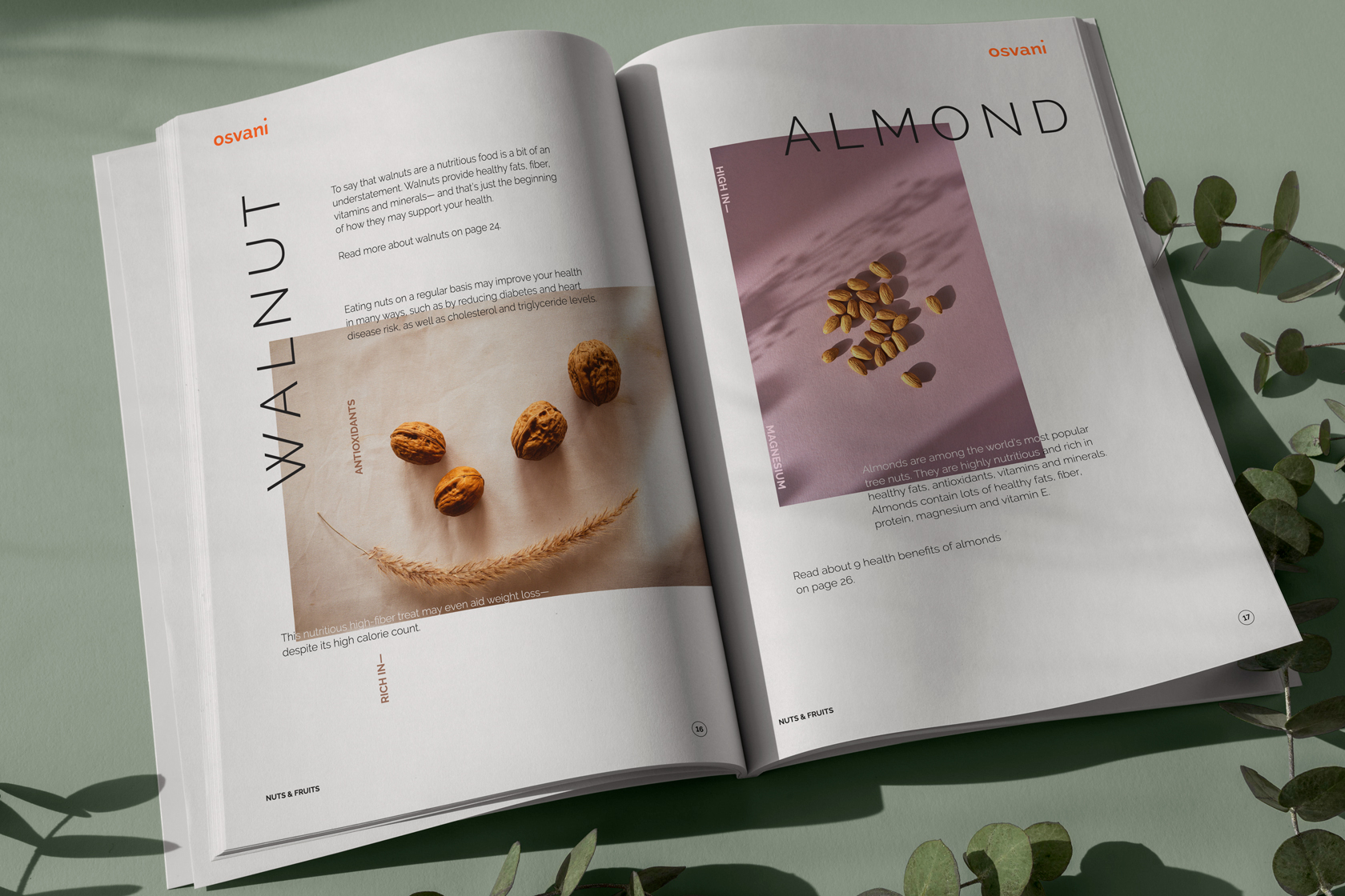
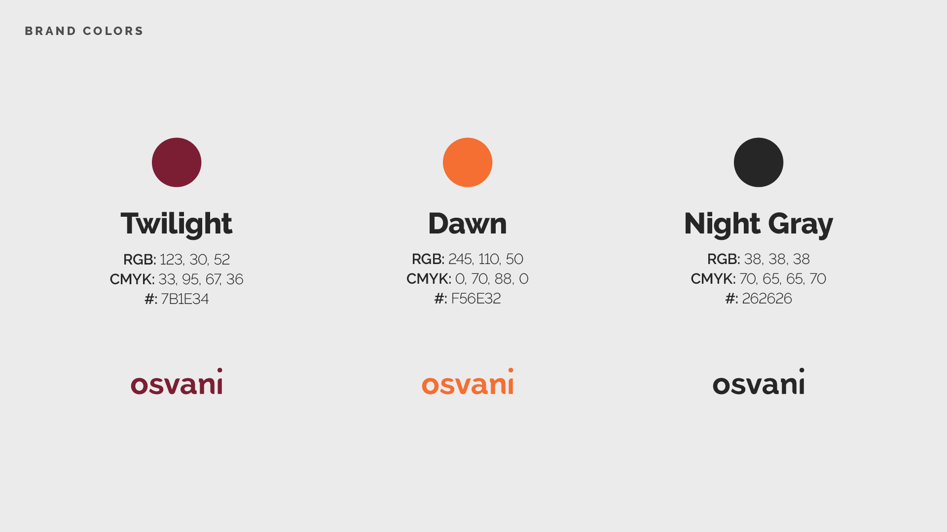
Next, Joe uses abstract organic elements, muted colors and gradients, to symbolize the natural composting process which occurs after you consume the product.
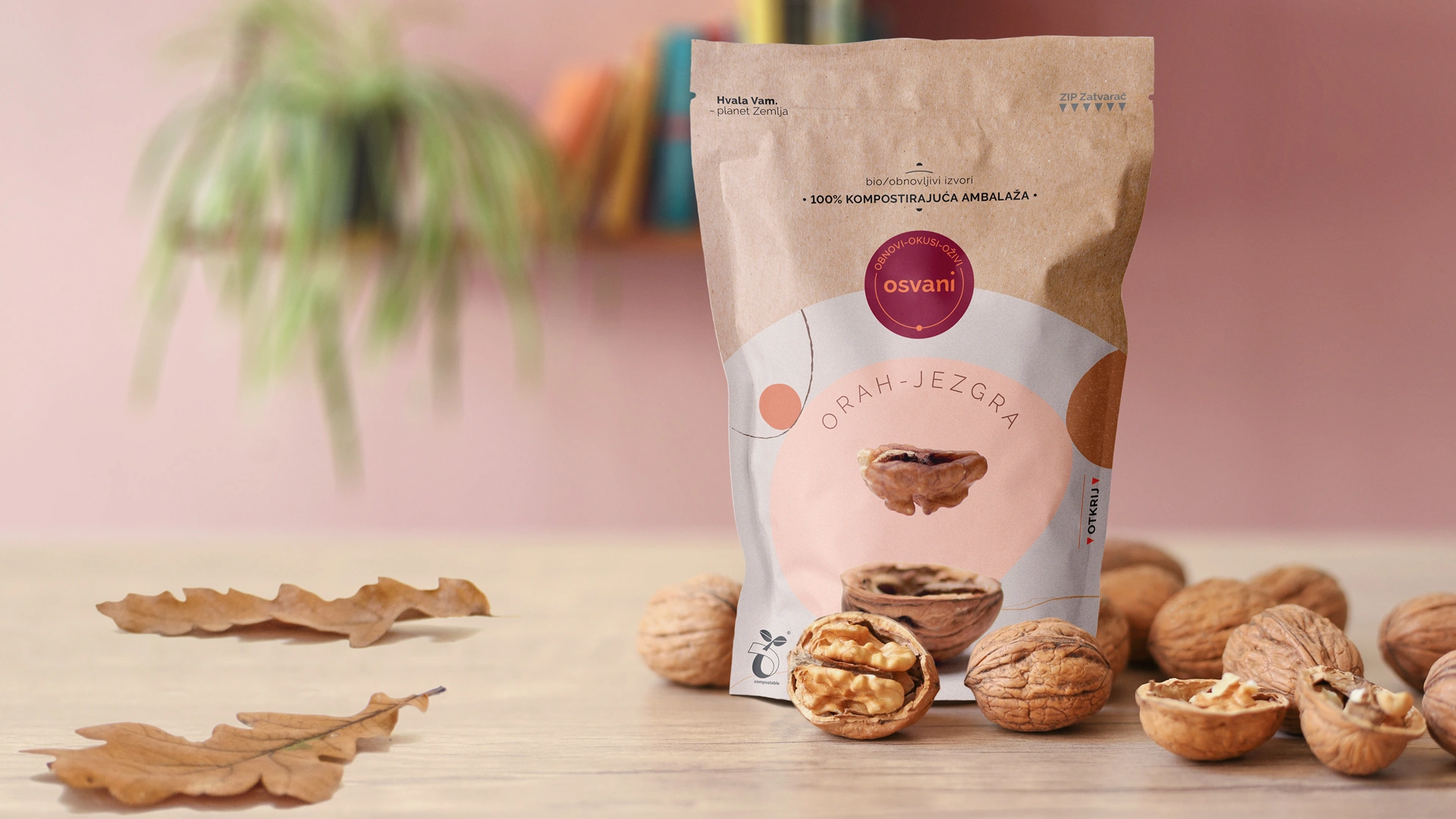
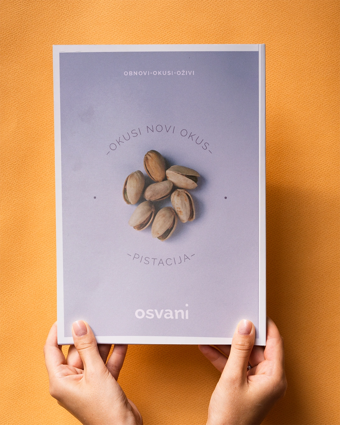
Photography is art directed in a specific way that shows a nut escaping from the shell—rising above it. It's a metaphor for escaping the norm.
Logo
Design
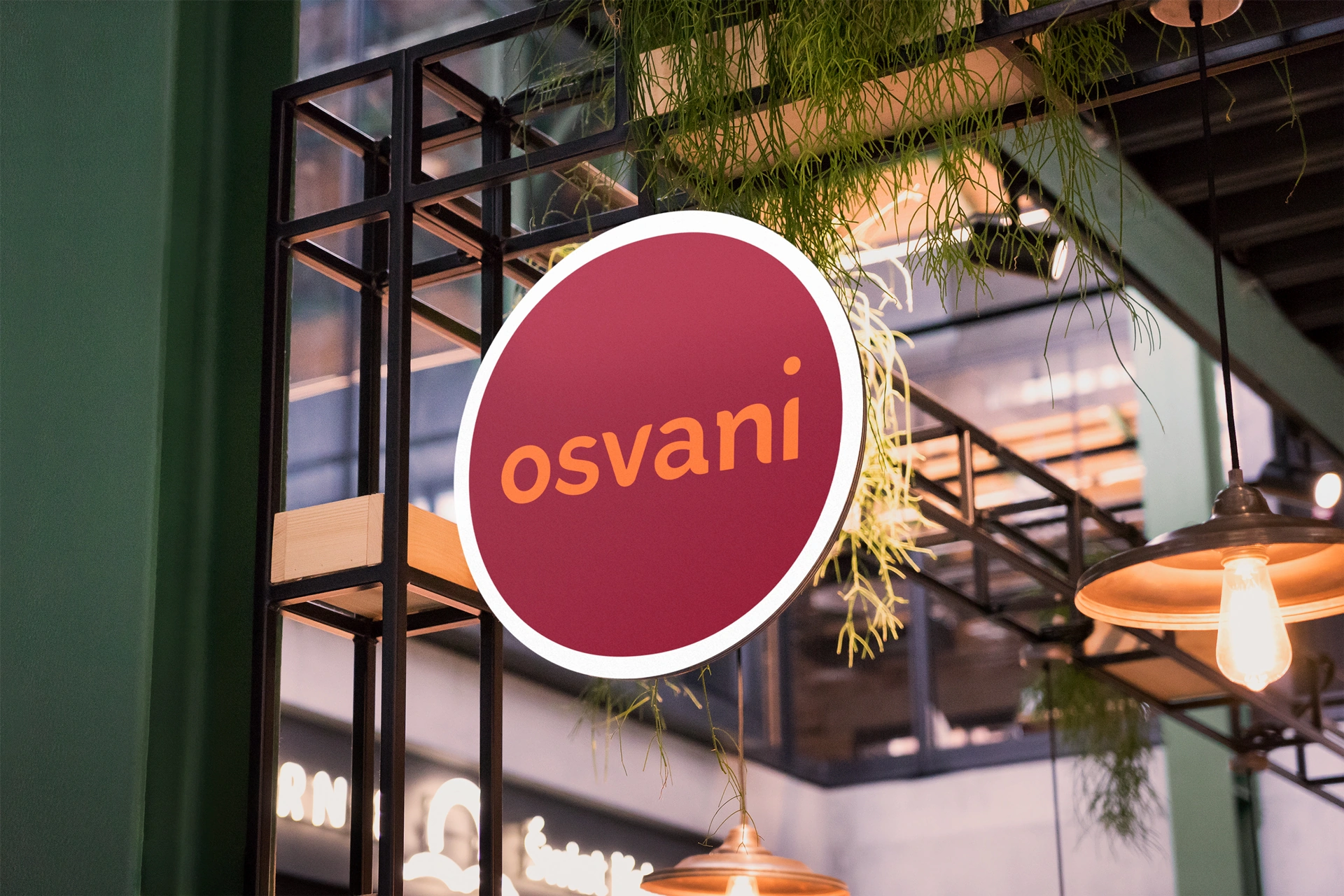
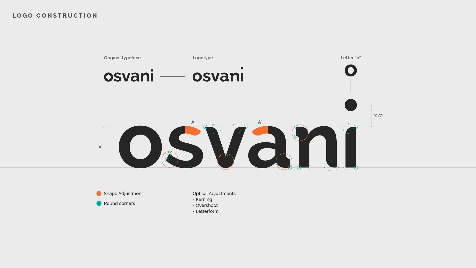
Raising the dot of the letter “i” achieves several connotations associated with the brand. It creates a visual representation of the sun rising above the horizon (to create a straight horizon, lowercase letters were used).
The simple logo animation shows this concept more clearly. The vertical movement of the dot represents the passage of time, from dusk to dawn. This reflects the idea behind the name of the brand—a new day, a new beggining.
Packaging
Design
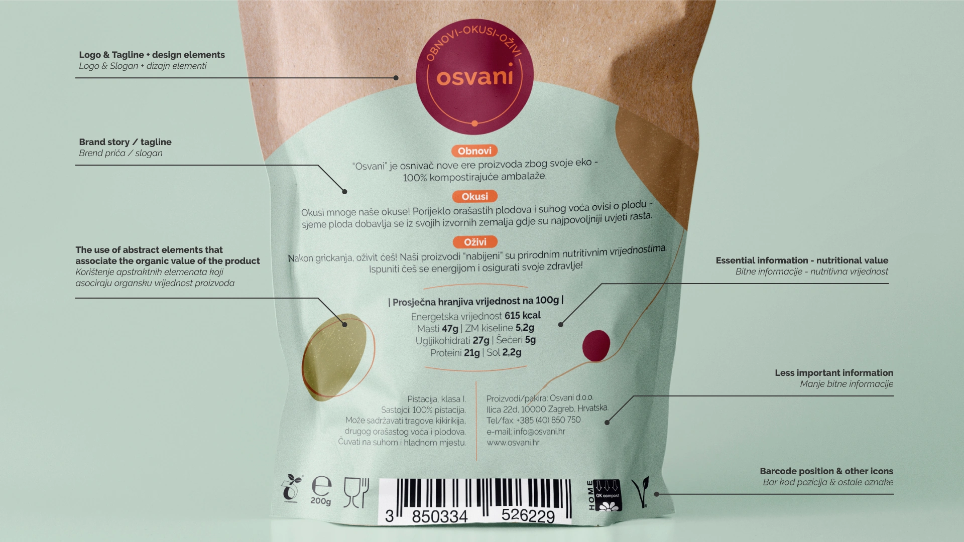
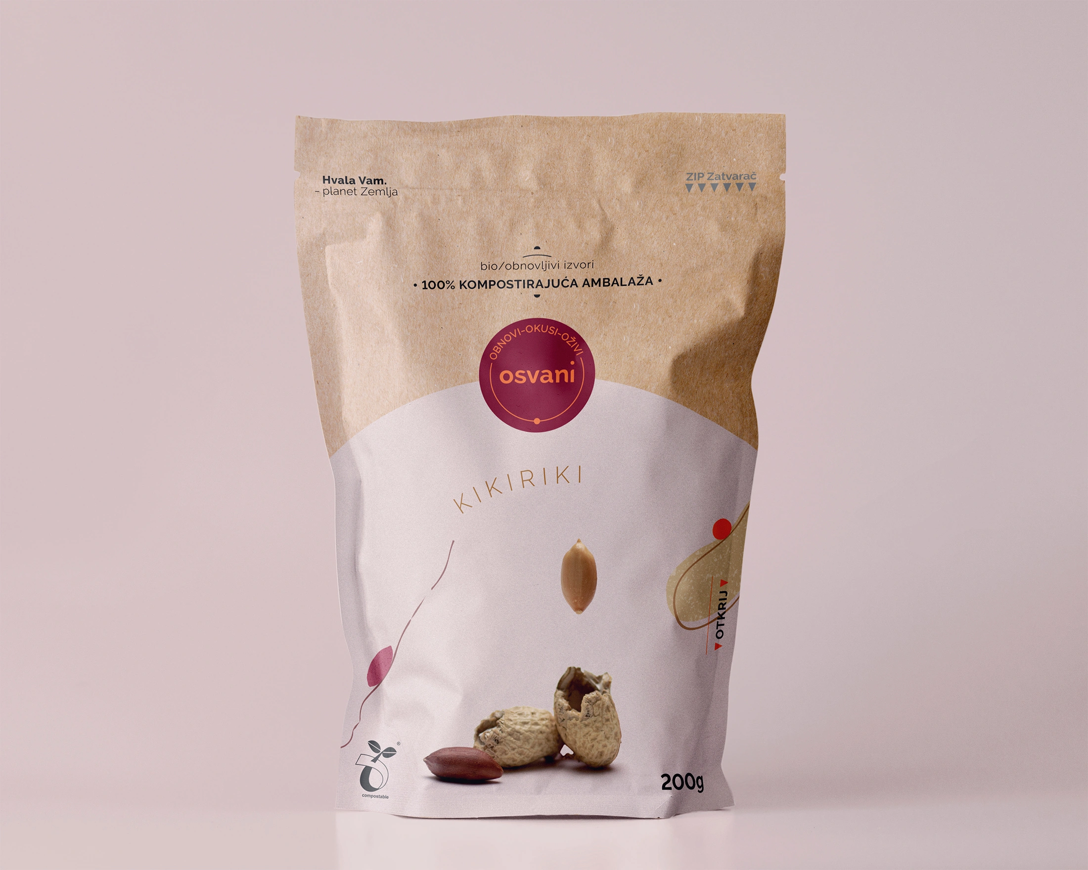
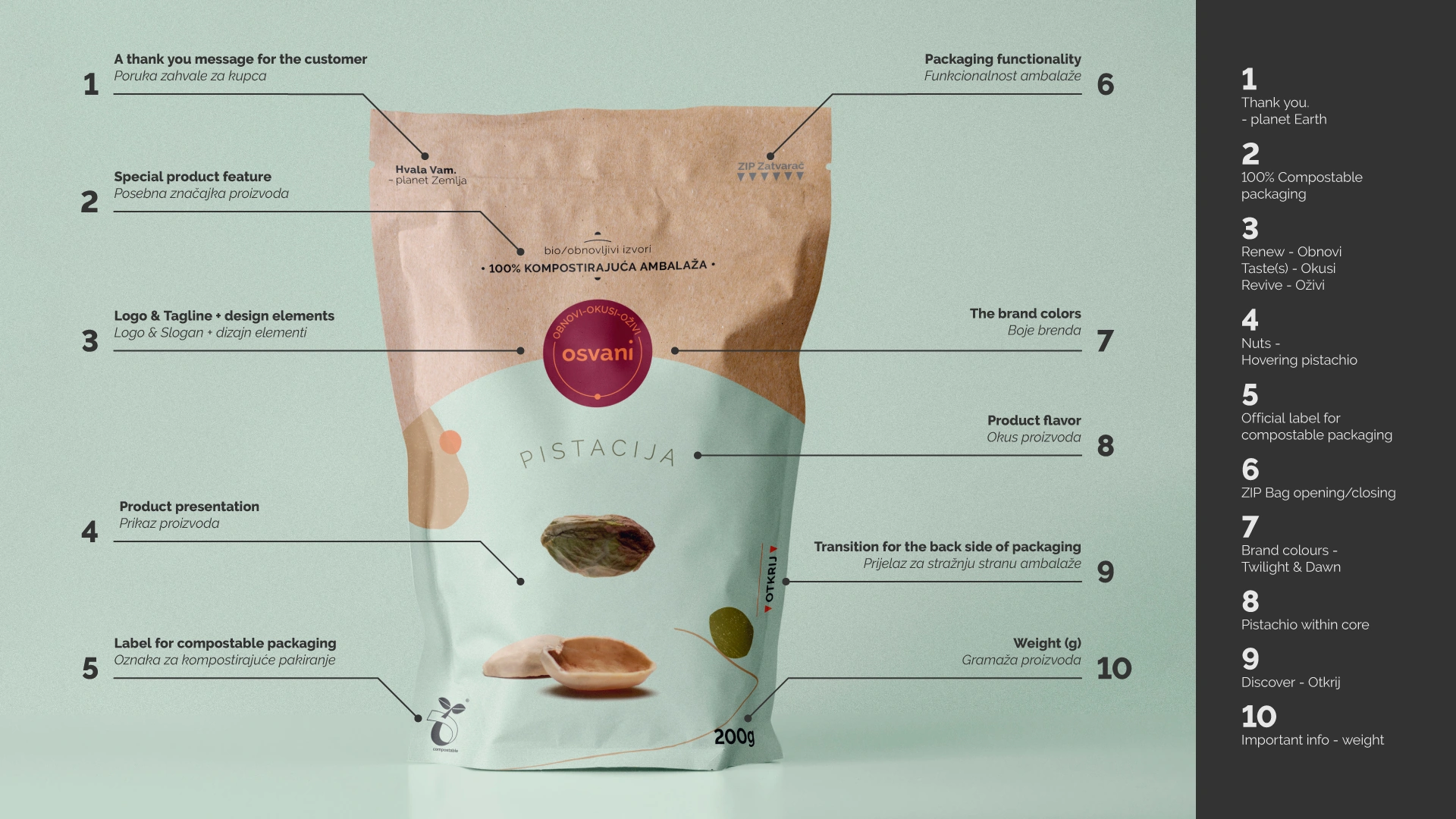
Finally, the last chapter is about packaging design. Packaging must showcase the features that represent the brand, but also what value / benefit it offers to a potential customer. Packaging of the product is the most important customer touch-point for the Osvani brand.
The packaging contains all the main components at once, such as: logo, tagline, brand story, messaging, special features (100% compostable), photography, and other parts of the brand identity system.
A detailed analysis of the front and back side of the packaging is presented below.
• Packaging Analysis—FRONT side
• Packaging Analysis—BACK side
