• CASE STUDY
01/04
LightHaus
Project information
Development, Graphic Design, Copywriting, Ads
LightHaus is an electrician company founded in Croatia. Although the company currently operates locally (capital city and the surrounding area), there are still many competitors within the industry.
Despite the fact that the electric-power industry has been around for a long time, most of the competitors still don’t offer any innovative solutions, but rather present themselves in a very conventional way. They provide a wide range of services for different projects and clients — making something for everyone.
However, in practice, we know that the greater the number of different services — the focus decreases, and the possibility of error increases. Ultimately, the overall quality of the service drops, and as a result, customers no longer trust the company.
After doing research and analyzing the competition (read the context), Joe identified gaps in the marketplace that LightHaus could potentially fill. The next logical step was to position LightHaus as an innovative company with a sharp focus on only a few services for which they can guarantee successful results. Specialization increases quality, and gives the potential client a sense of security and trust, which is extremely important in the electrical industry.
A strategic plan was created, which was then implemented into the brand’s visual identity (style: bold, brave, strong, technical and precise), verbal communication (voice: brief, confident, reliable and trustworthy) and the main digital product — the website (UI/UX: simple, yet interesting).
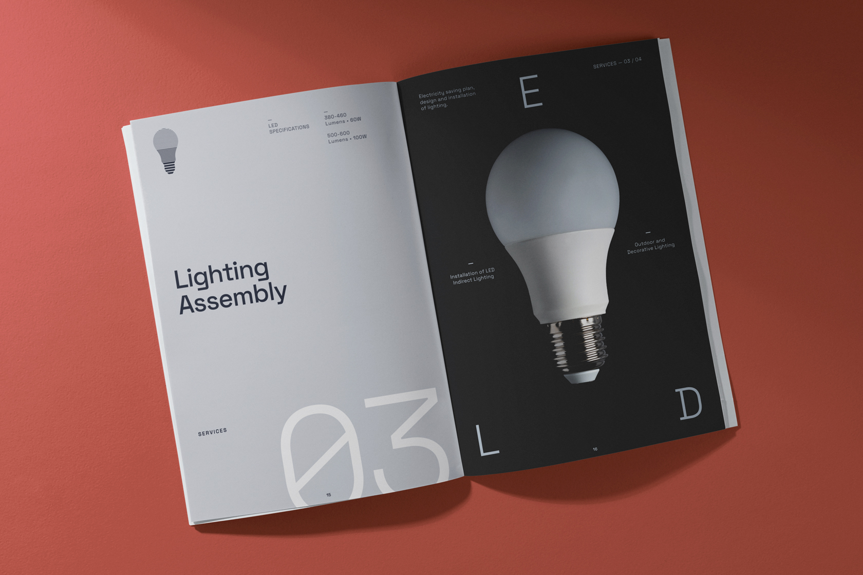
Brand
Strategy
The first aspect of positioning: the company has a sharp focus on providing a narrower range of services, thereby providing consistently high-quality and innovative solutions for B2B projects.
The second aspect of positioning: it refers to the relationship with customers (D2C). The company strongly stands out from the competition because it presents itself to clients as an authoritative guide they can rely on, due to the sense of security, strength and trust that LightHaus provides them.
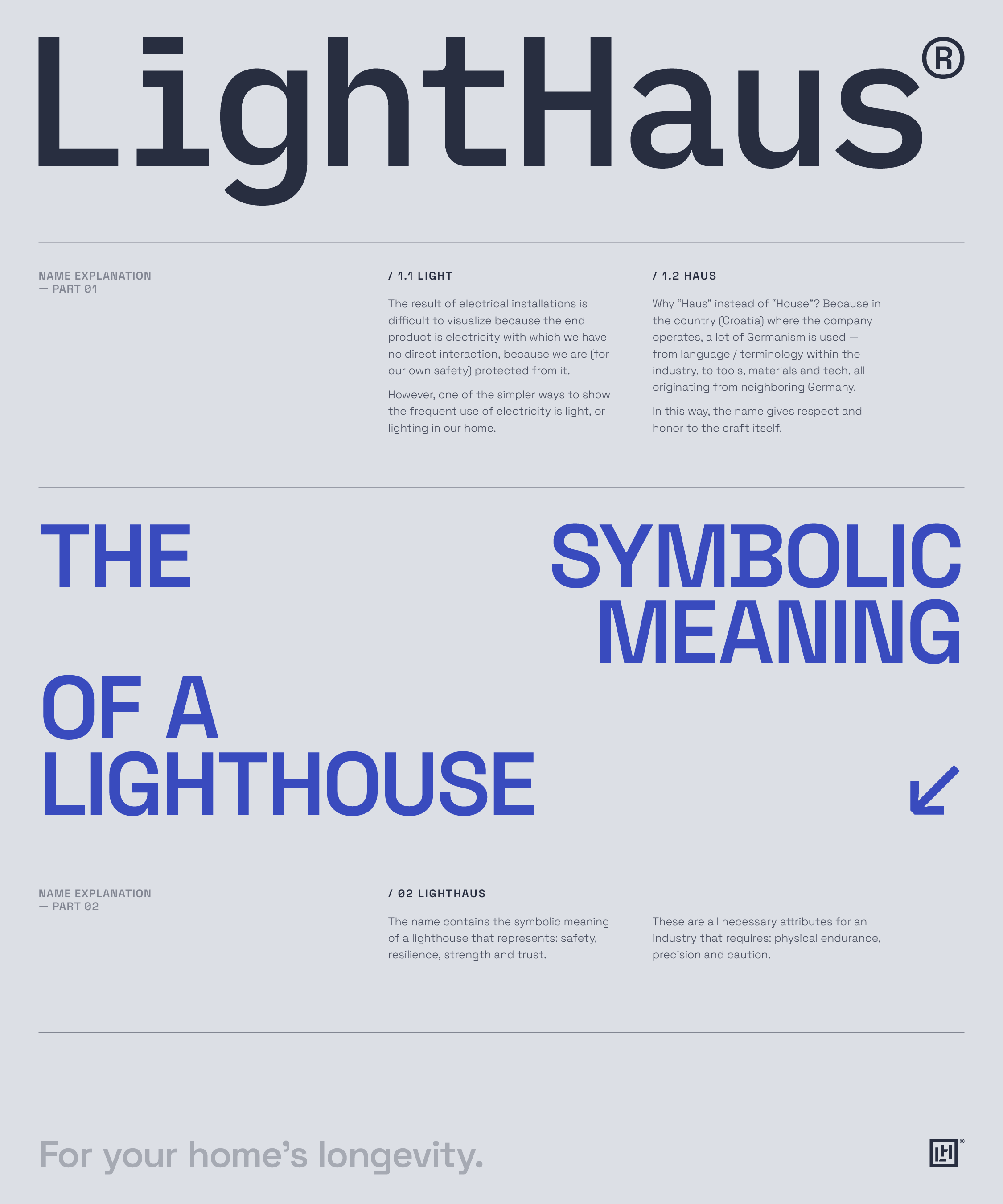
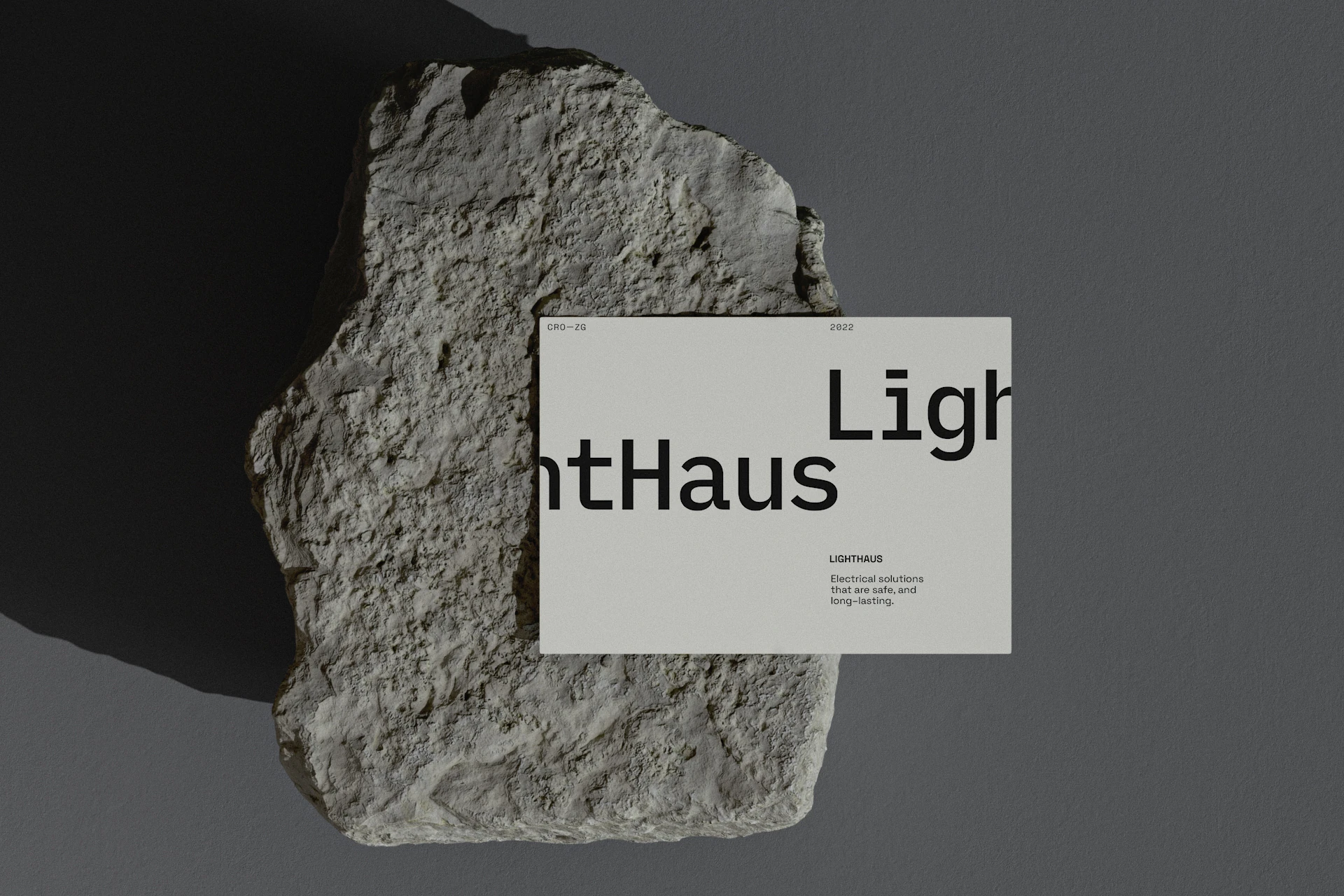
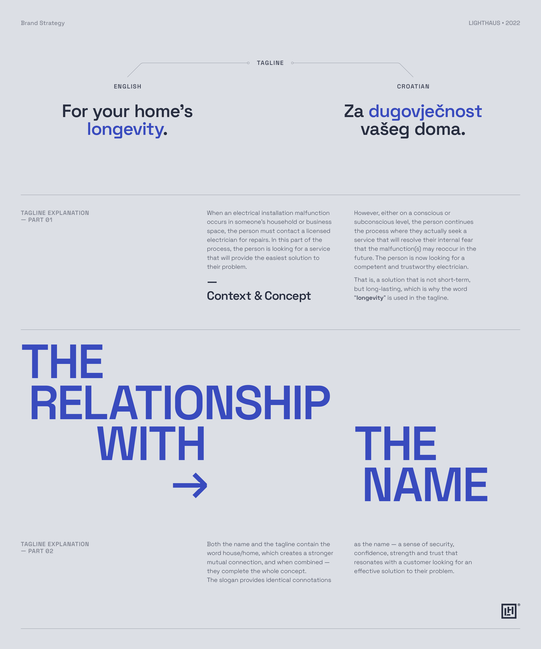
Tangible results are most evident in the company’s name and tagline, which are explained below. The strategy is of course implemented through the rest of the brand’s visual and verbal communication.
• NAME EXPLANATION
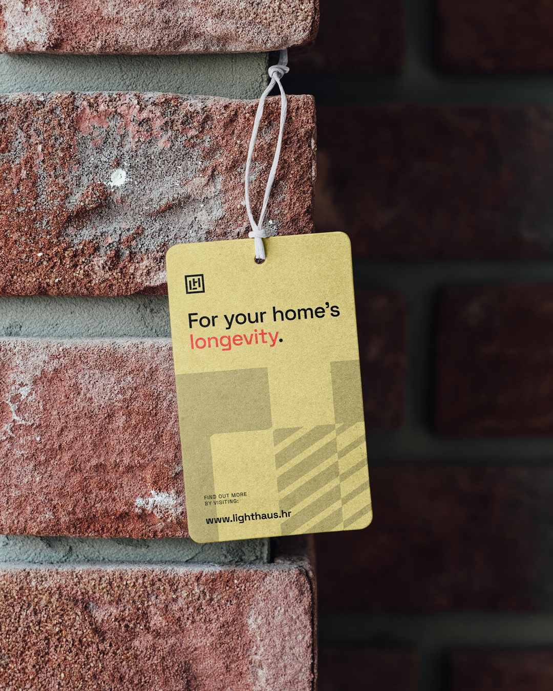
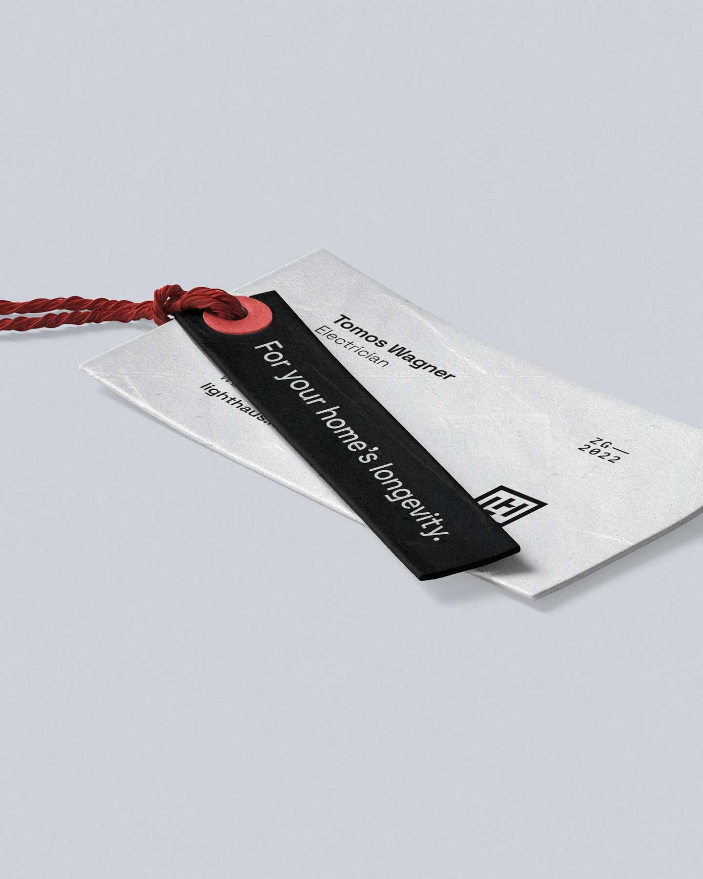
• tagline EXPLANATION
Logo
Design
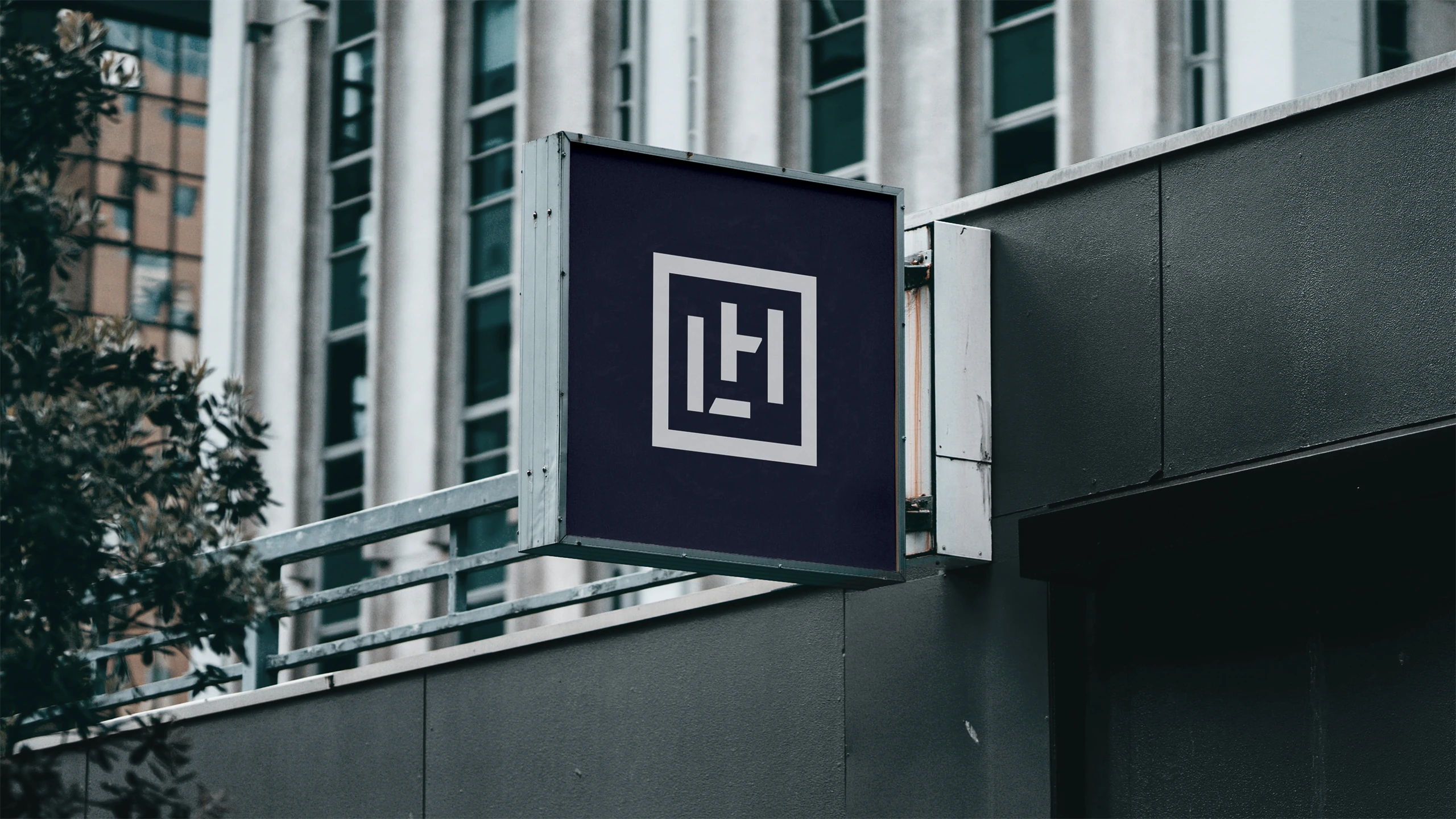
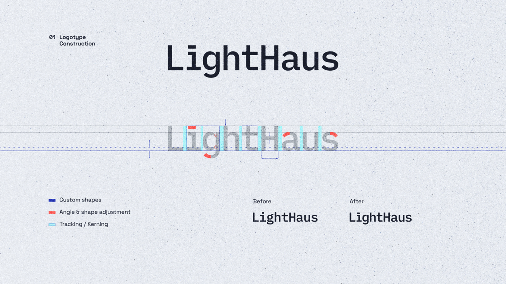
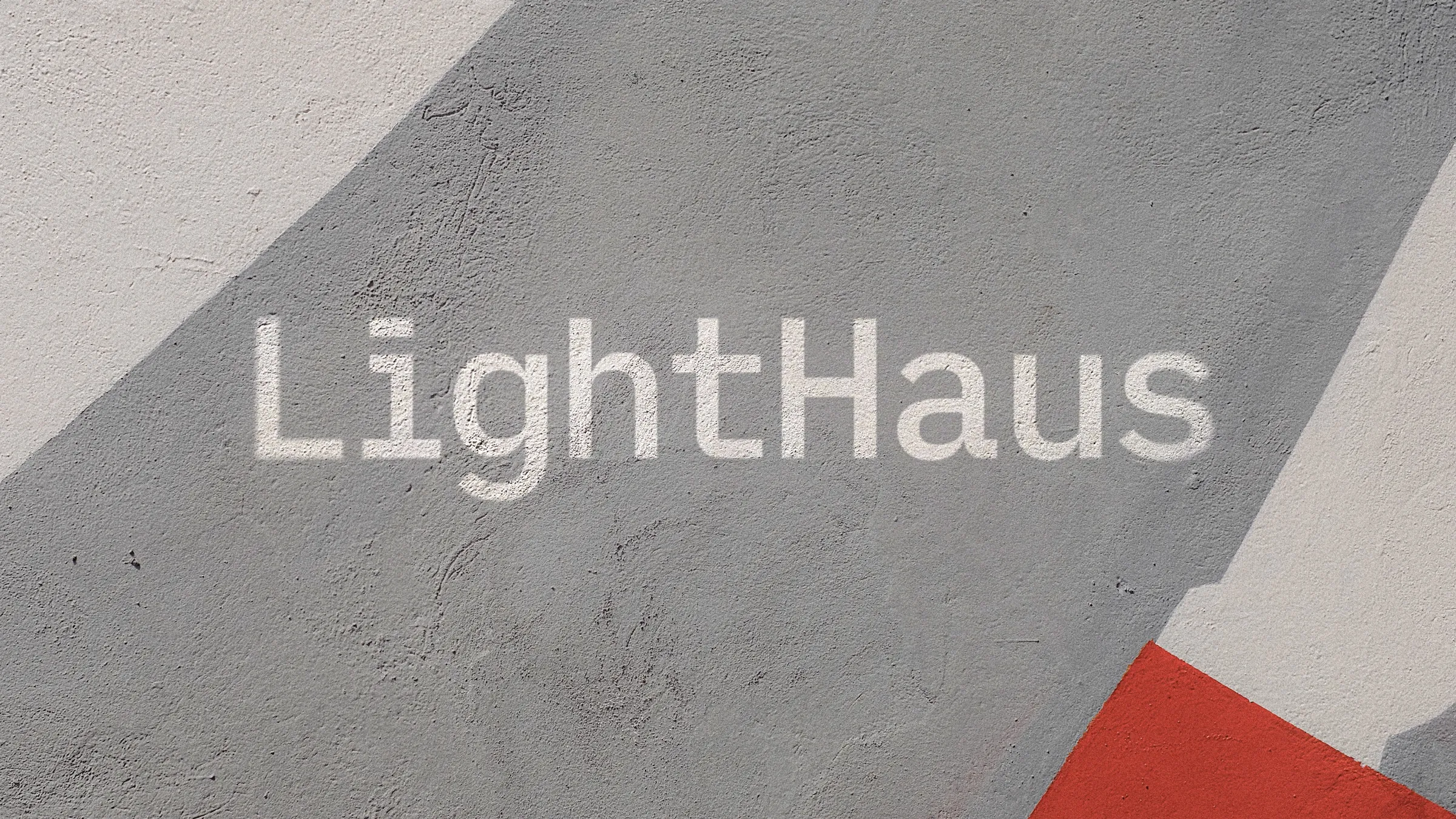
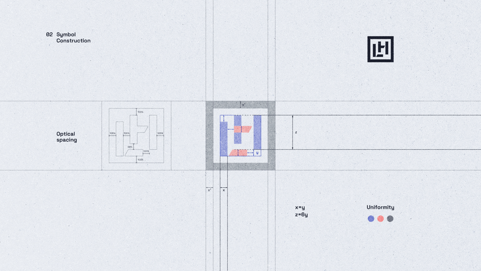
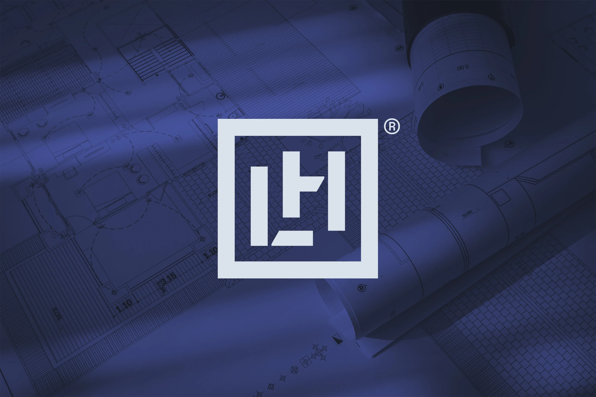
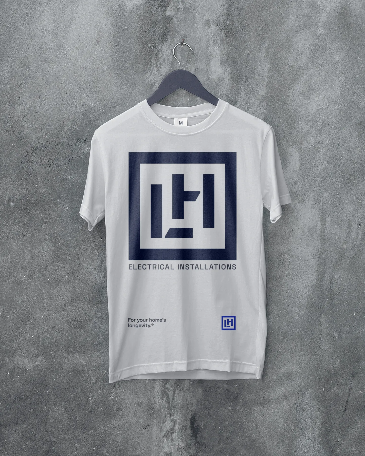
Two versions of the logo were designed—monogram and wordmark. The inspiration for both logos comes from the depiction of blueprints that use very simple elements of rectangles, squares, and lines to indicate the floor plan of a house or building – also, where the electrical components will be installed.
Which is why the anatomy of the logo’s letters, as well as the construction of the monogram, is precisely executed using rectangular shapes and similar geometric elements to achieve a calculated, technical / mechanical impression. Final solutions give connotations of strength, stability, confidence and assurance.
/ Part 01
Visual
Identity
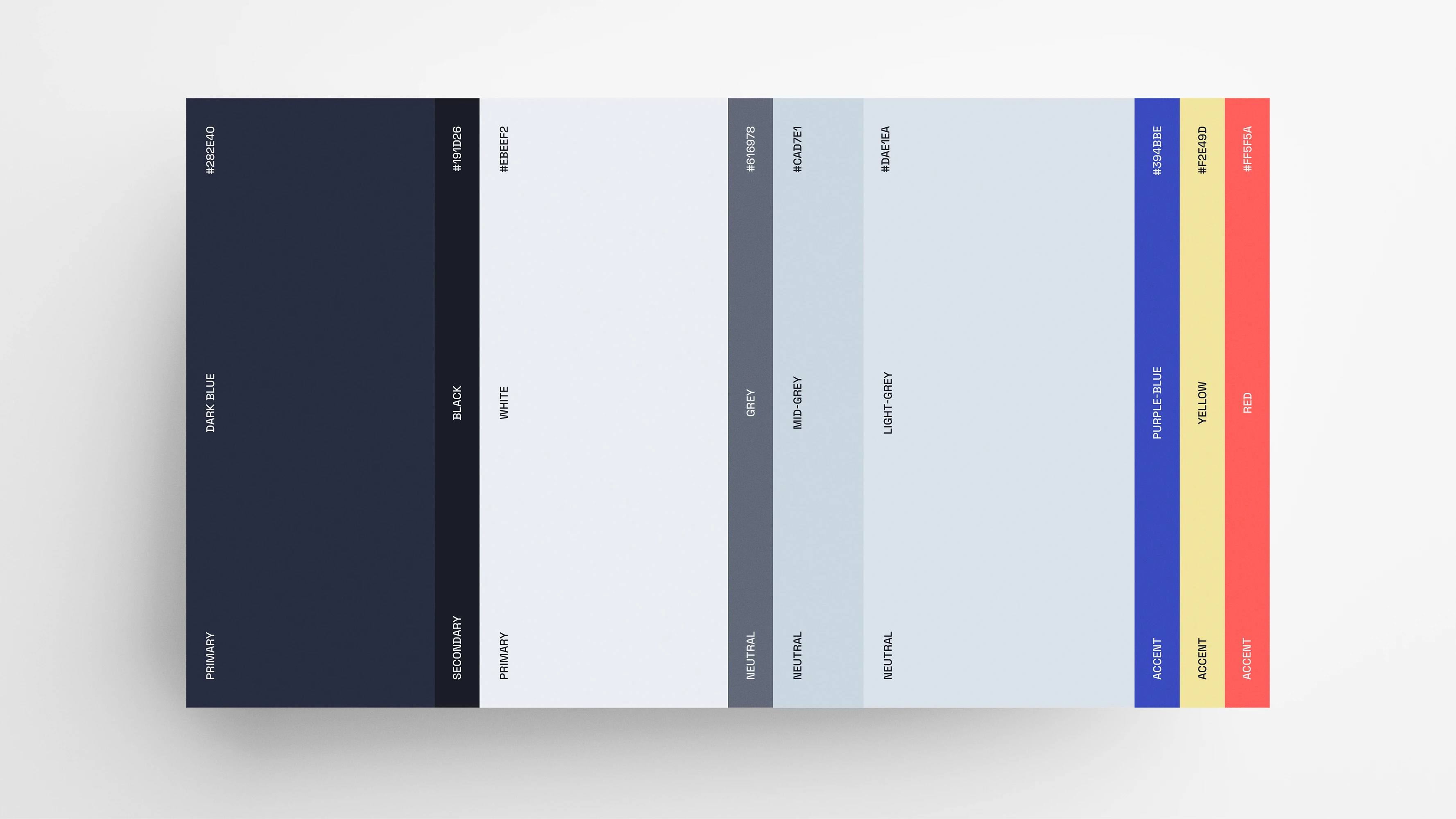
In addition to the logo design, the visual identity is defined through typography, color palette, graphic elements, photography and composition. The typography is realized through the use of a single, sans-serif, monospaced font. Typography contributes to the same impression as the logo (explained in the previous chapter).
The palette defines colors that give a sense of urgency, i.e. the use of color represents a signal for help—just like a lighthouse. In the industry, emergency interventions (power outage, electric circuit problems, etc.) are very common.
/ Part 02
Visual
Identity
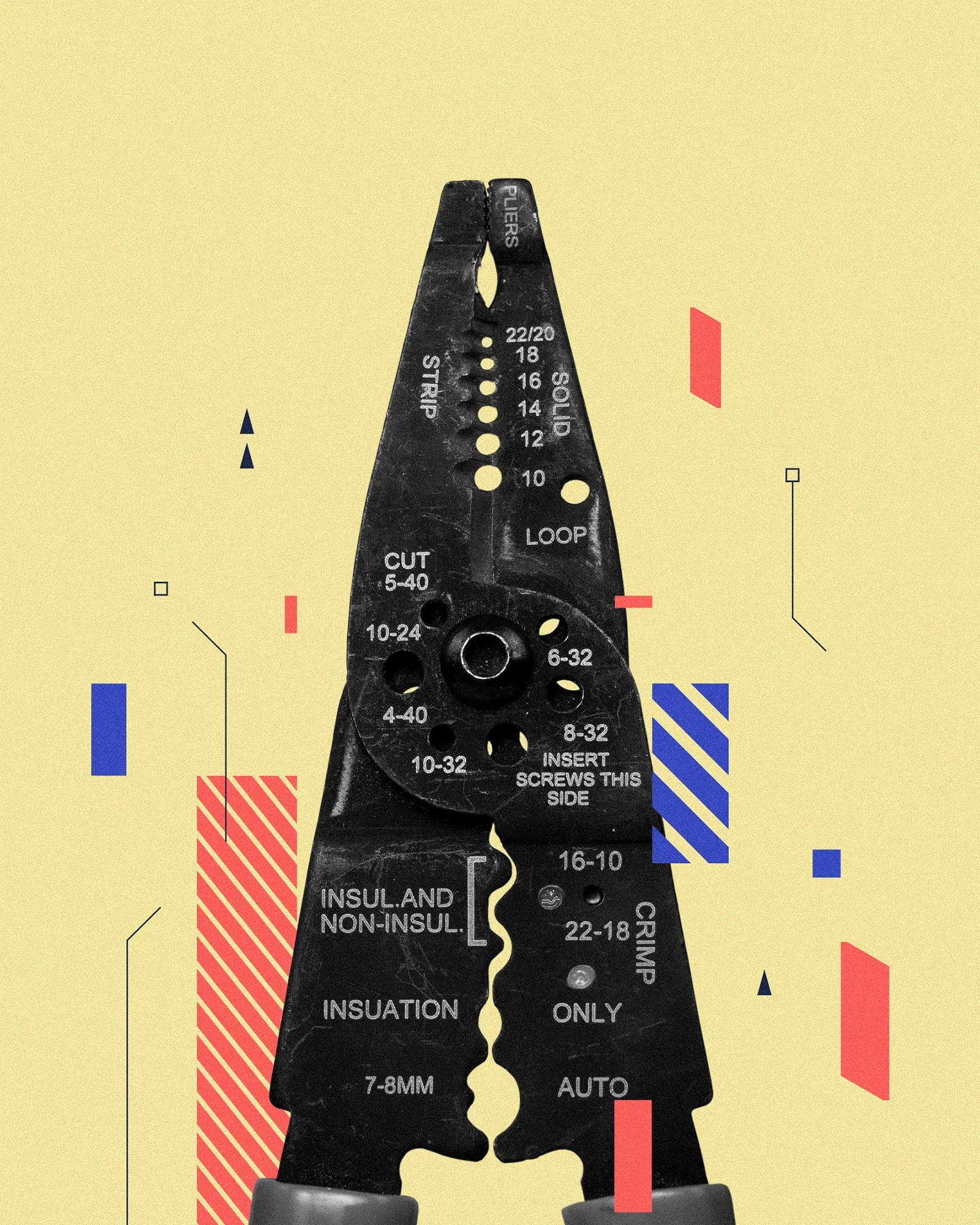
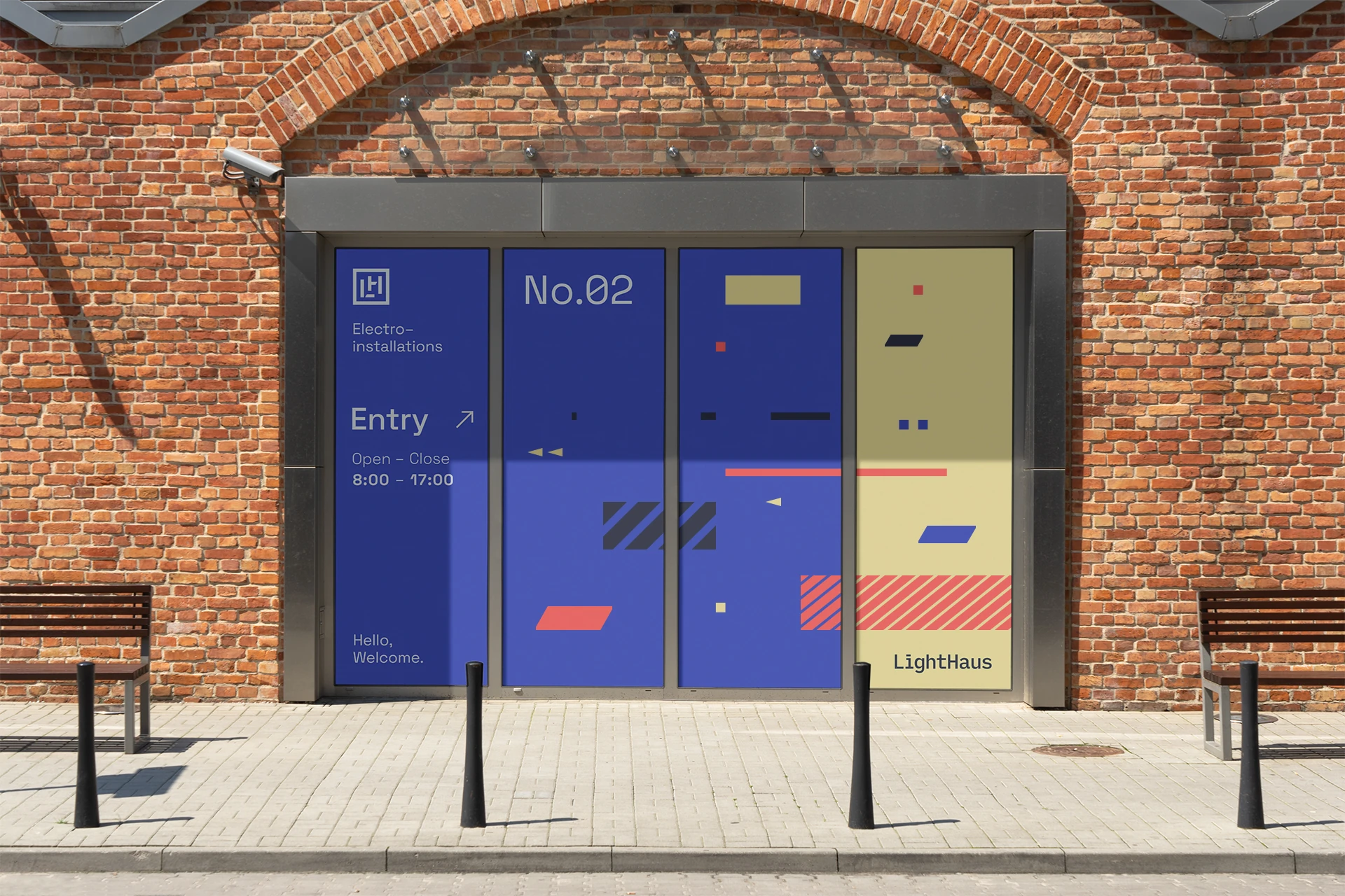
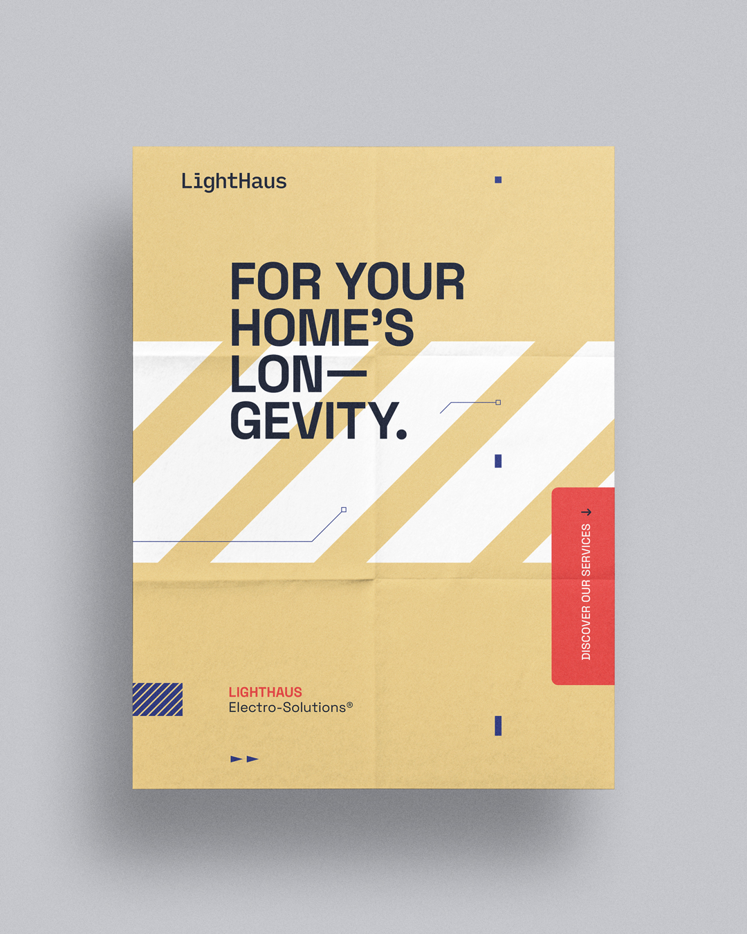
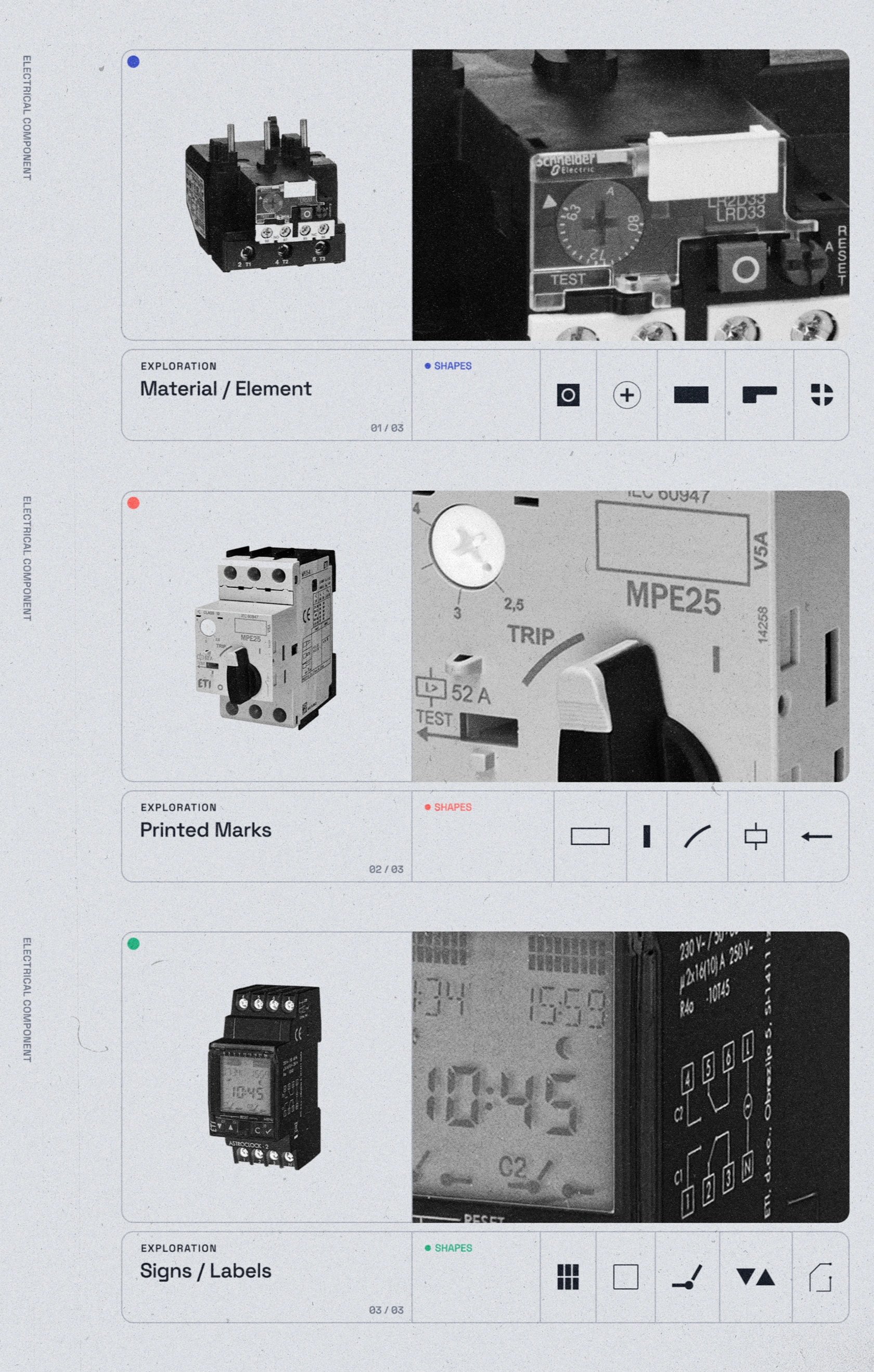
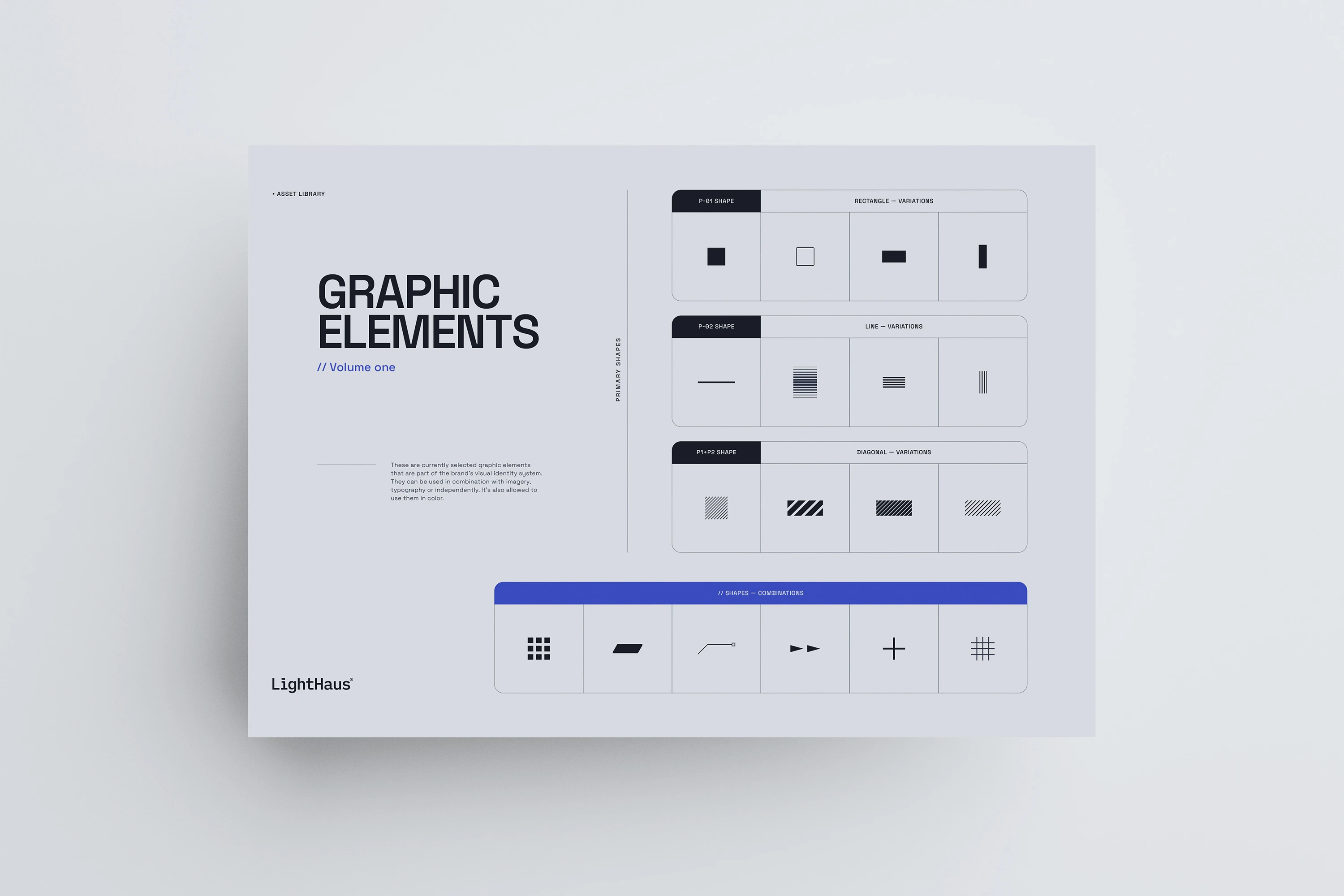
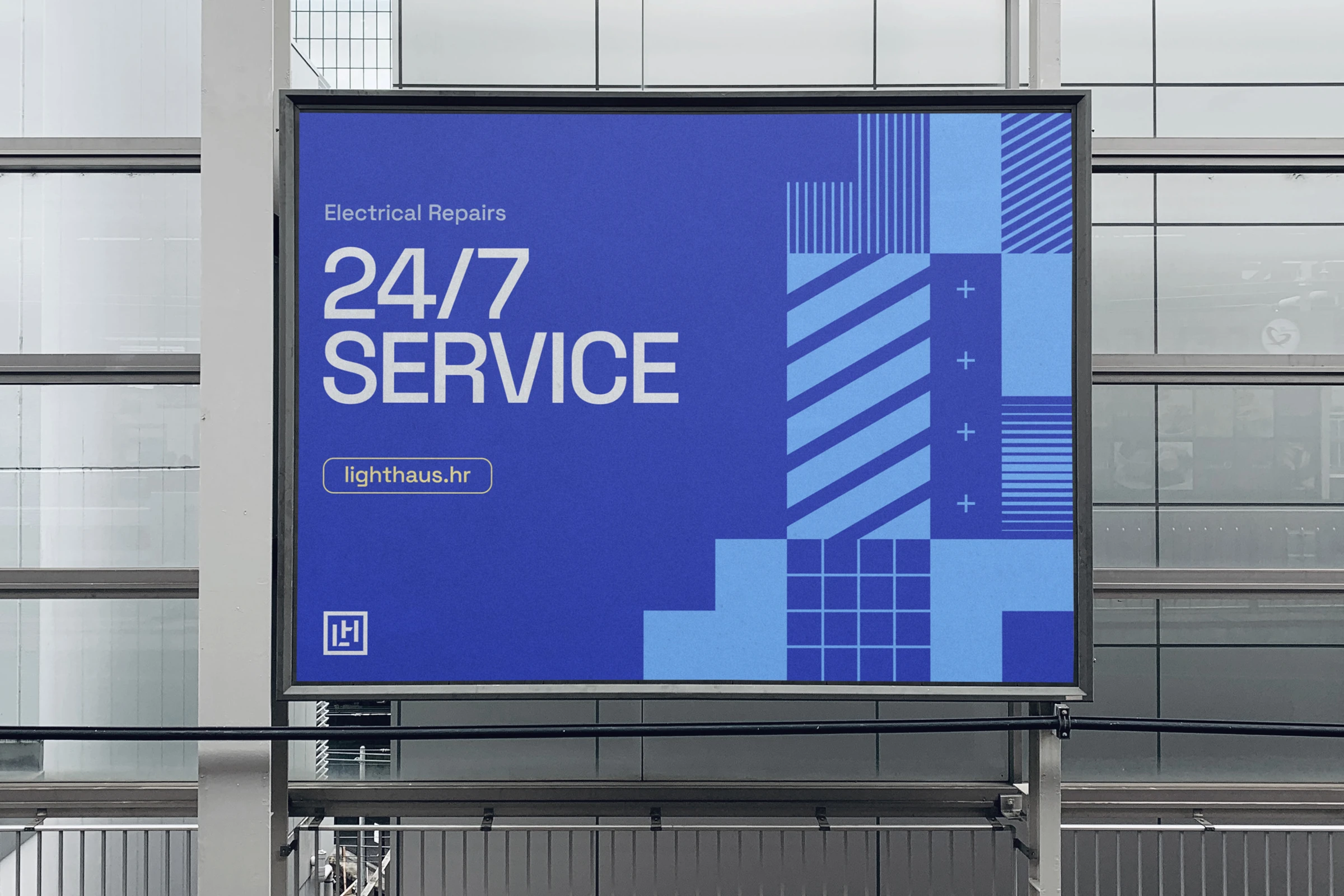
The graphic elements are inspired by the details found on objects and materials used in the industry—once again paying homage to the craft. It also creates a visual style that provides various possibilities of use. Photography follows the same idea by highlighting the details of the motif / subject of the photo.
Although the elements are arranged neatly, the contrast in changing the size of the elements still gives us the connotations of something bold and brave.
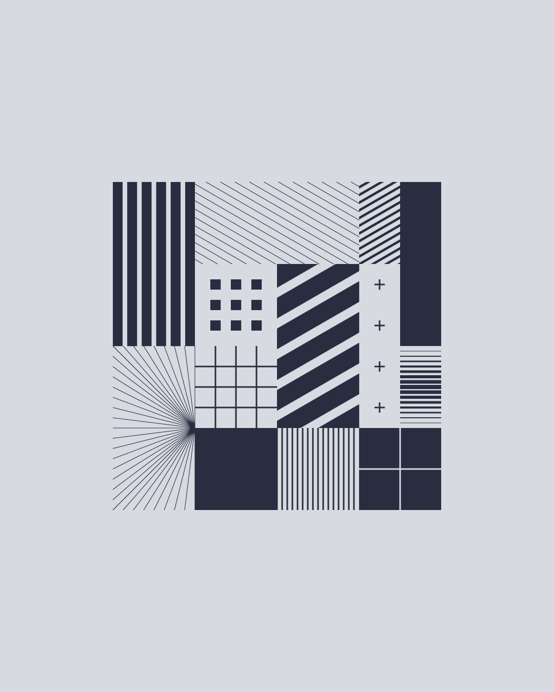
• Graphic elements—Inspiration
Web
Design
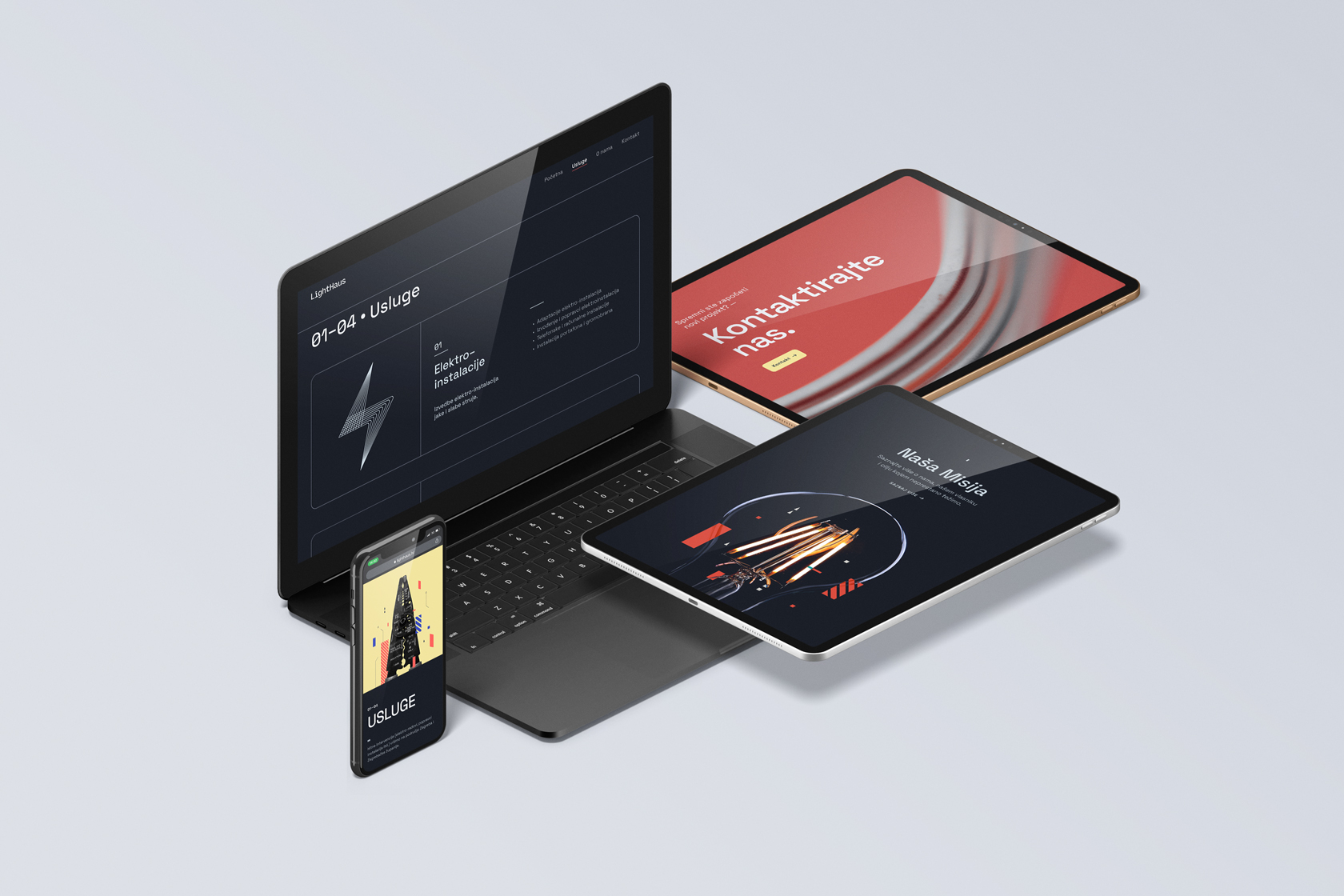
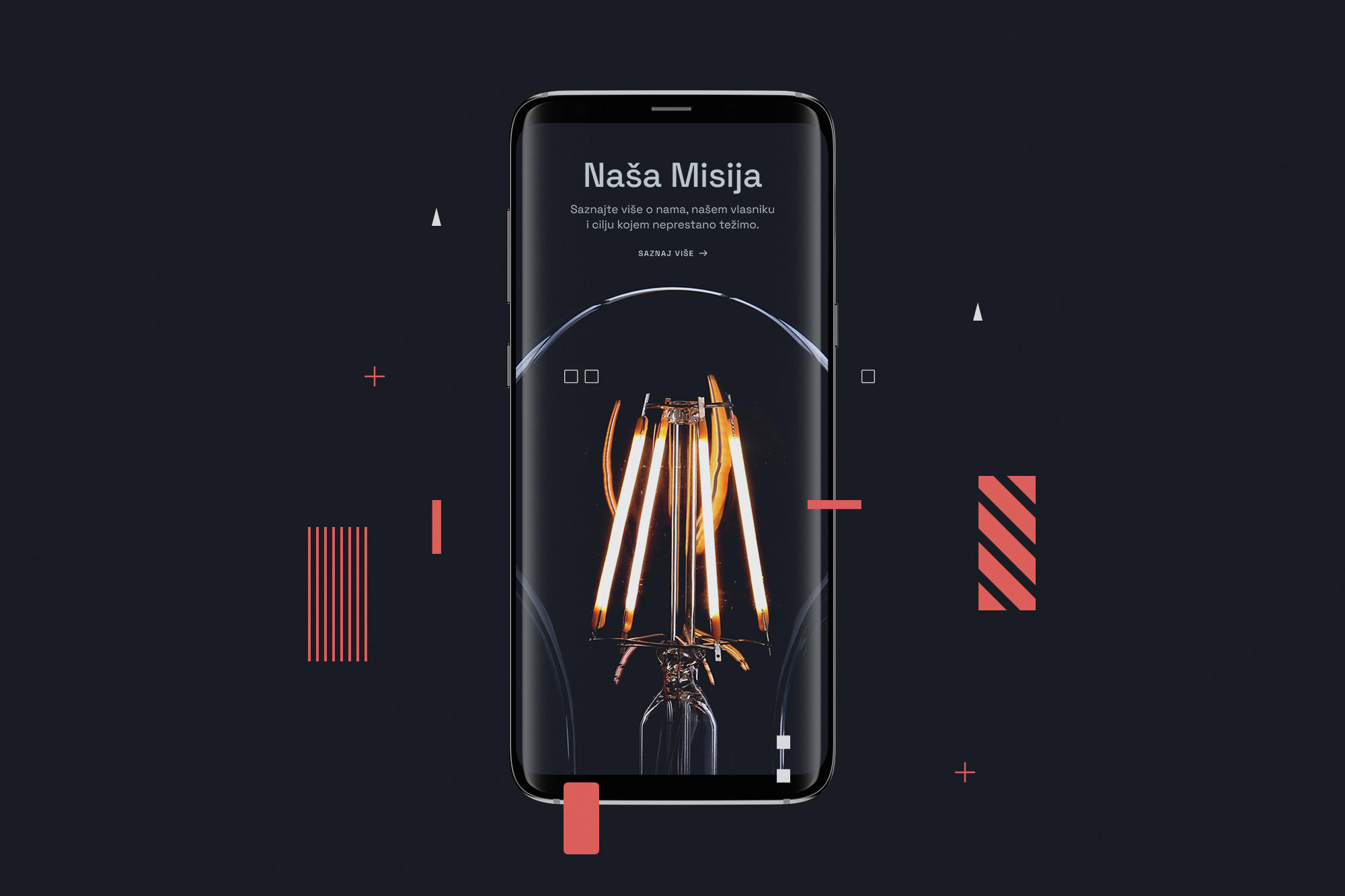
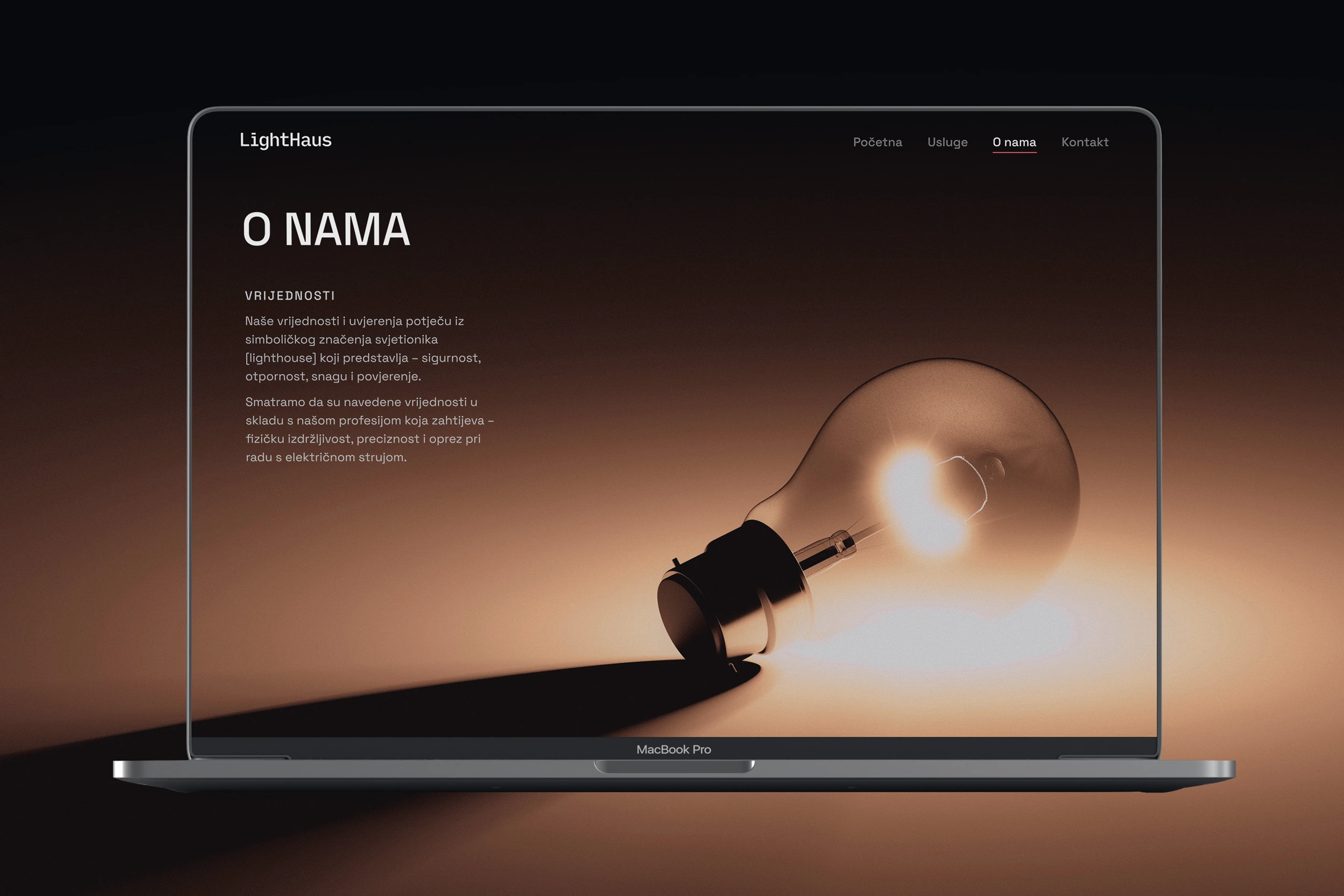
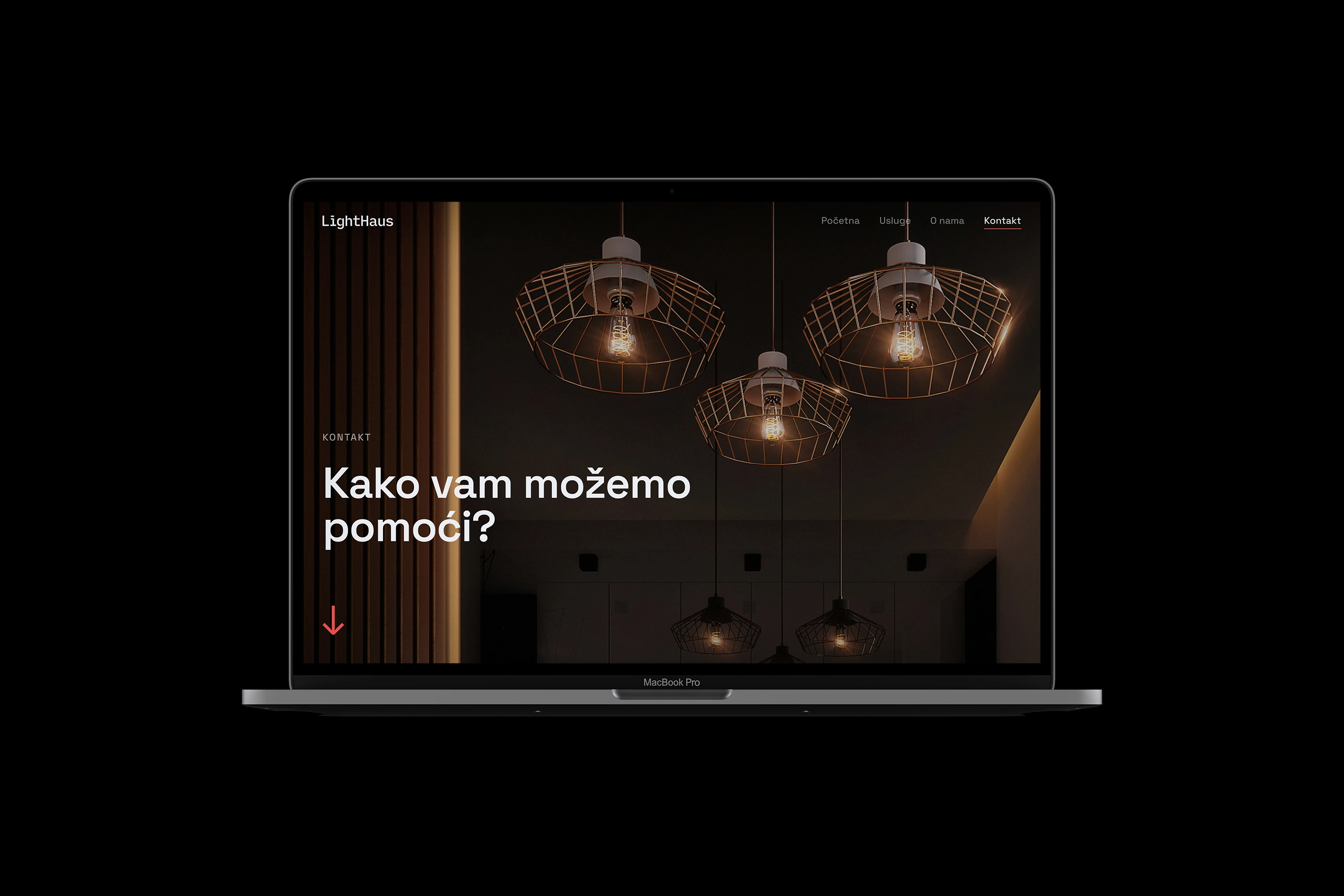
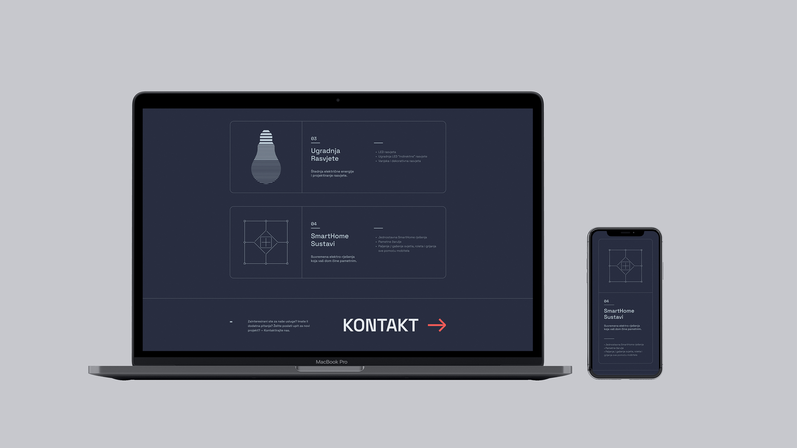
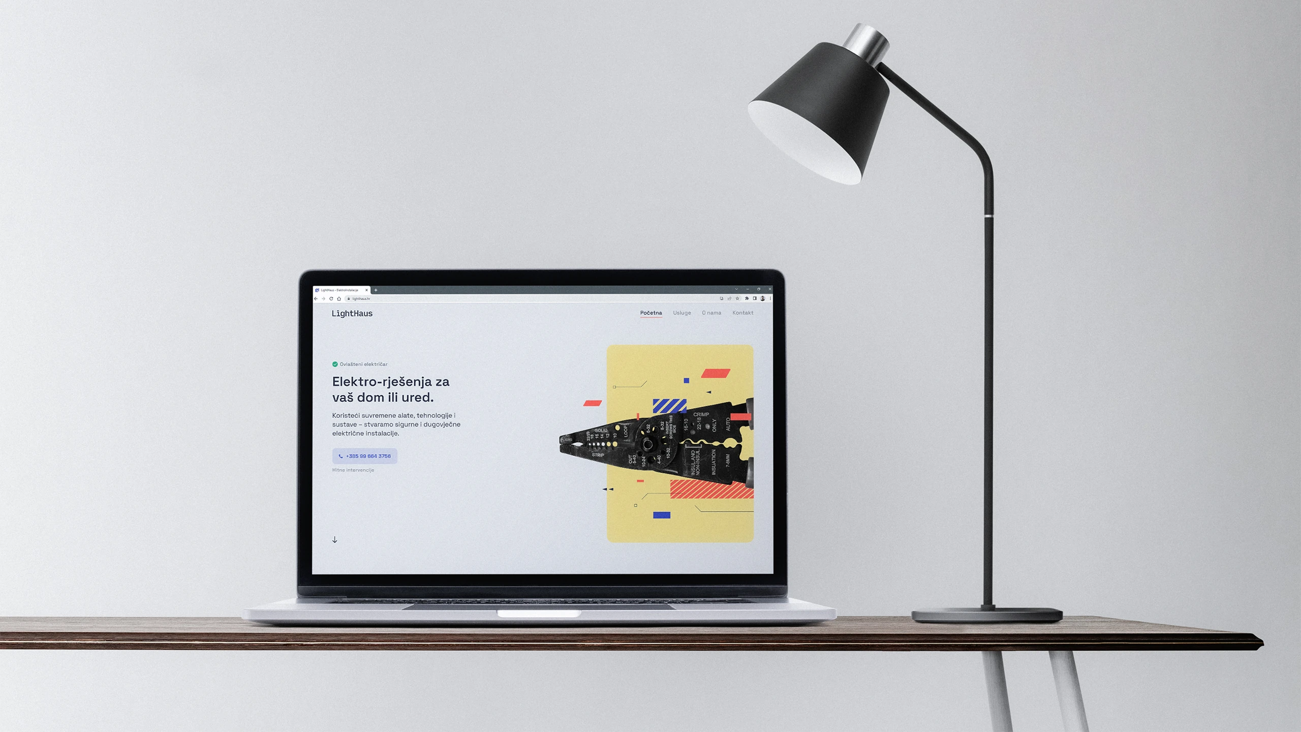
The home page is designed to serve as an overview. It doesn’t go in-depth with all the information, but rather offers one call-to-action for each segment, so the user isn’t overwhelmed with choices. In this way, only essential information is highlighted. As for the visual style, it was decided to take a safer route that won’t deviate too much from the already established, modern laws and principles of digital product design.
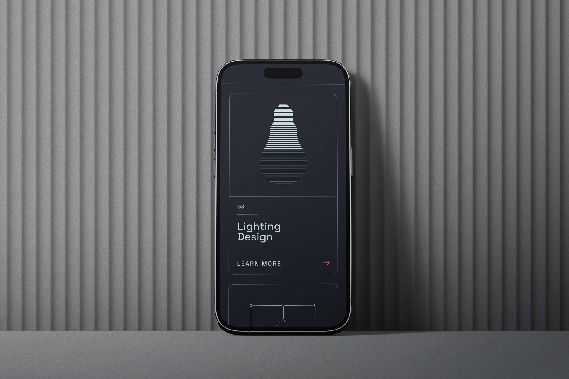
To further enhance the user experience, visual elements and interactions are used to create a break from purely textual information. Also, with the help of creative and interesting interactions, there is a much greater possibility that the user will remember the website and visit it again, which creates a higher opportunity for conversion rate.
• Overview
